ManageCasa Property Management Software
real-estate · product-shot
7
craft
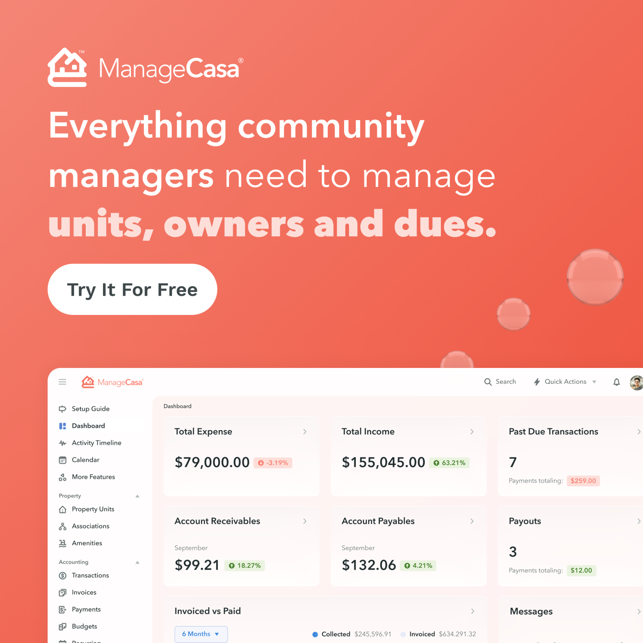
The design uses a heavy top-down visual hierarchy where the saturated brand color acts as a container for high-legibility white typography, transitioning into a light-mode UI representation.
Palette
#f27361
background · 49.5%
#fef7f6
surface · 37.3%
#f38a7c
secondary · 3.7%
#fac5bd
accent · 2.6%
#f6a094
accent · 2.4%
#d9d8d8
neutral · 2.2%
Composition
headline plus visual
Layout
top heavy
Color structure
neutral plus accent
Background
subtle gradient
Typography
sans · geometric sans
Imagery
ui screenshot · flat
Temperature
warm
Accent lands on
ui status tags, decorative bubbles
Mood
organizedreliablemodernapproachable
What makes it work
- flush-left alignment of all typographic elements
- high-contrast white text against warm saturated background
- bottom-anchored cropped product visual
- pill-shaped primary cta button