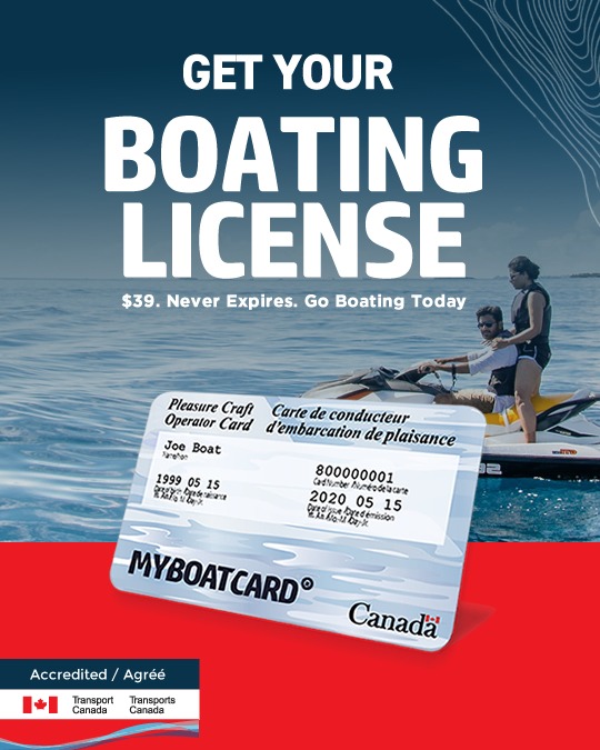
MYBOATCARD.com
government · image
5
craft
Visual hierarchy is strictly top-down, using extreme type scale to establish priority before showing the physical product. The red band serves as a structural anchor for the government accreditation logos.
Palette
#ed1a23
accent · 16.8%
#08334b
secondary · 9.5%
#7793a4
neutral · 18.2%
#19435b
background · 7.9%
#617c8d
surface · 8%
#eef2f6
text · 10.6%
Composition
headline plus visual
Layout
stacked bands
Color structure
neutral plus accent
Background
photographic
Typography
sans · sans only
Imagery
product shot · realistic
Temperature
cool
Accent lands on
bottom band, logo detail
Mood
What makes it work
- Oversized uppercase sans-serif headline centered in upper half
- Realistic product card floating with drop shadow
- High-contrast red accent band at bottom for visual weight
- Topographic vector line overlays for thematic texture
More like this
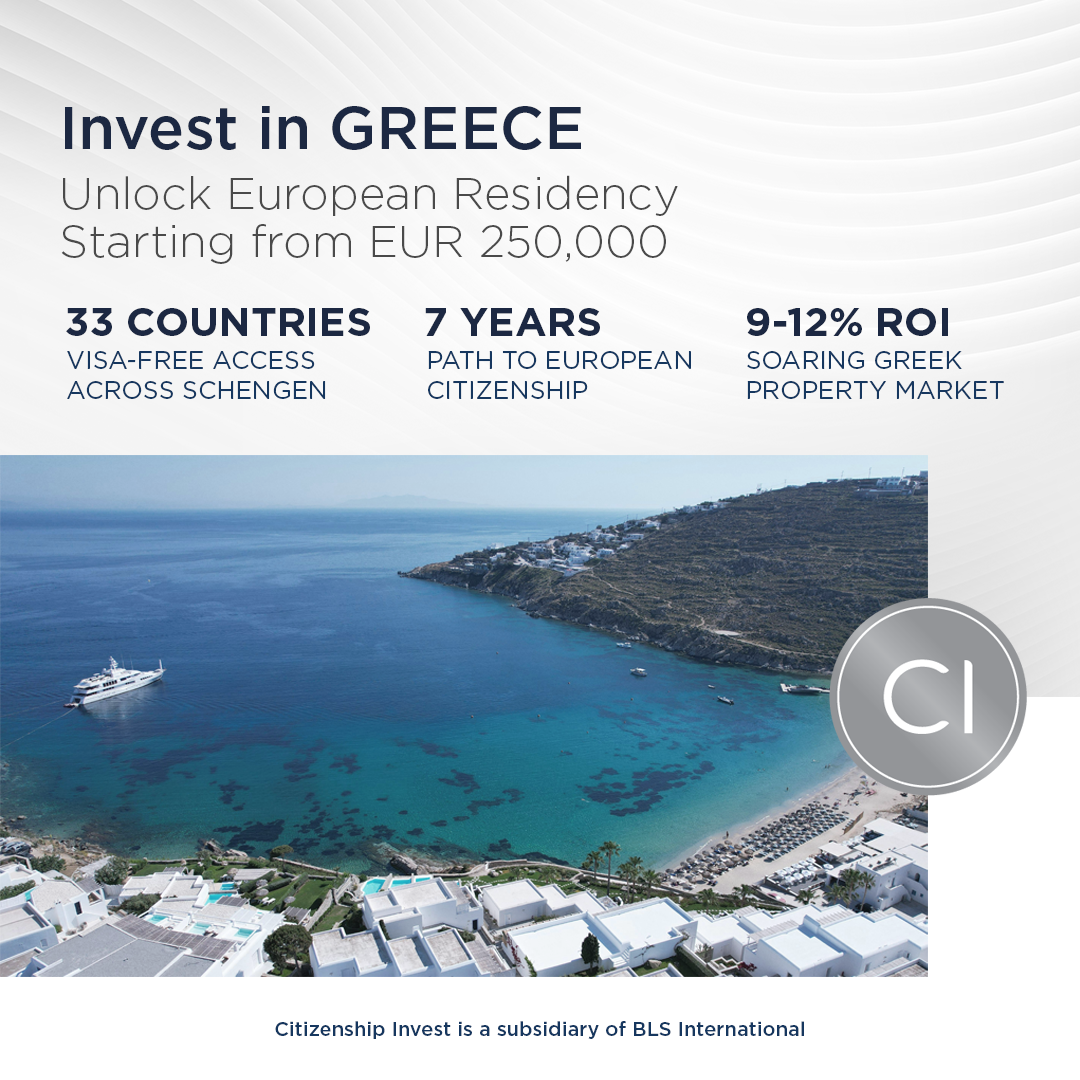
Citizenship Invest
real-estate · neutral plus accent
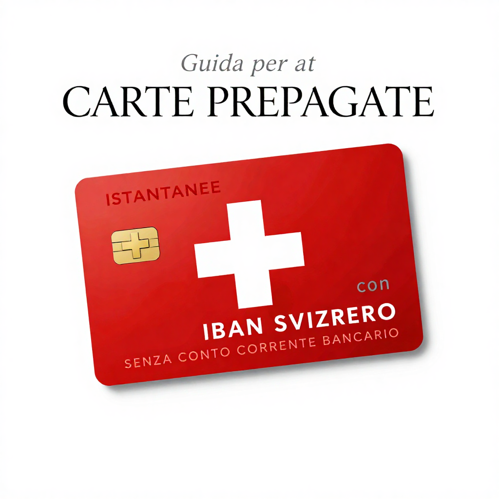
My-Obamacare-Rates
fintech · neutral plus accent
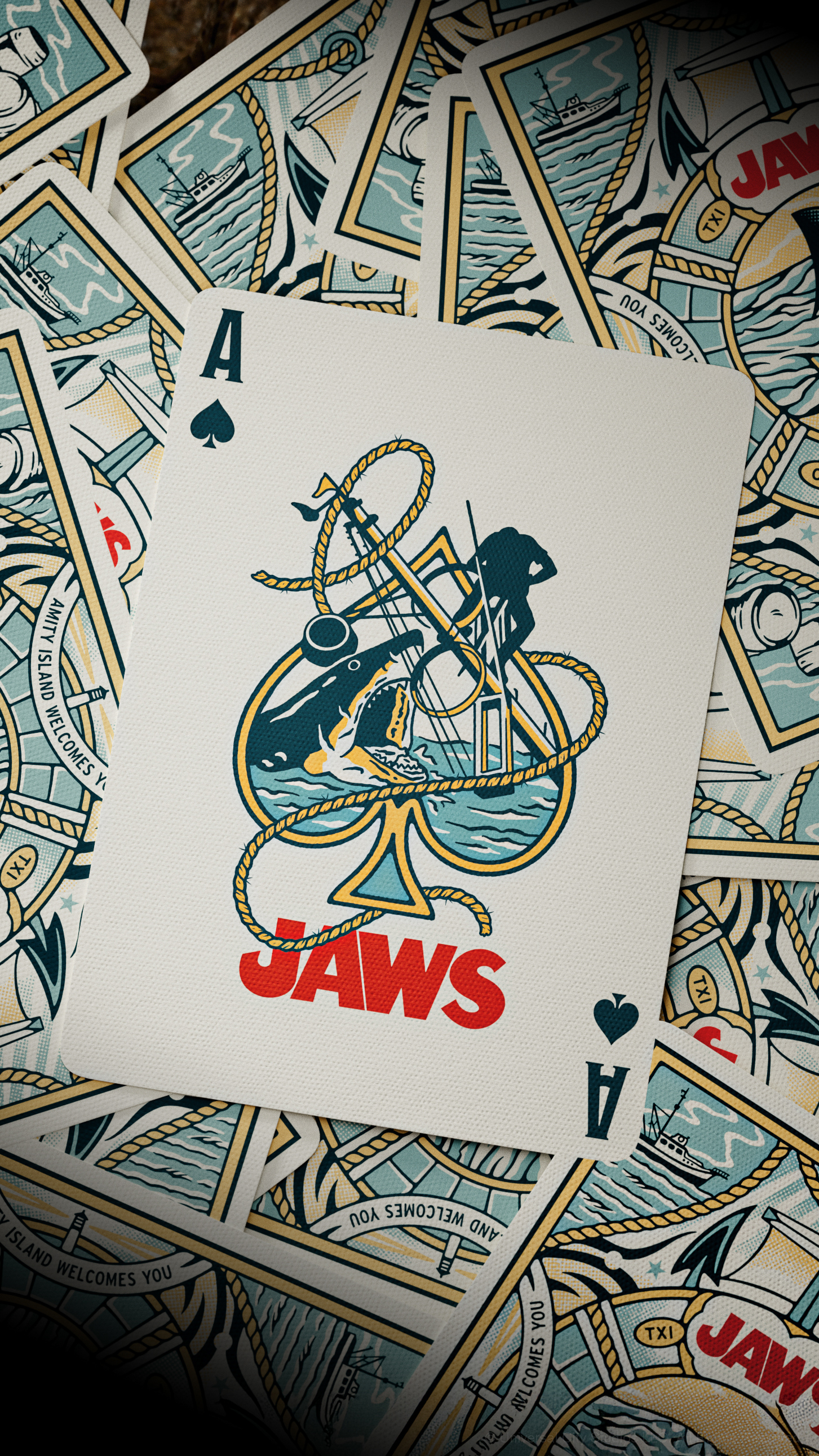
theory11
entertainment · neutral plus accent
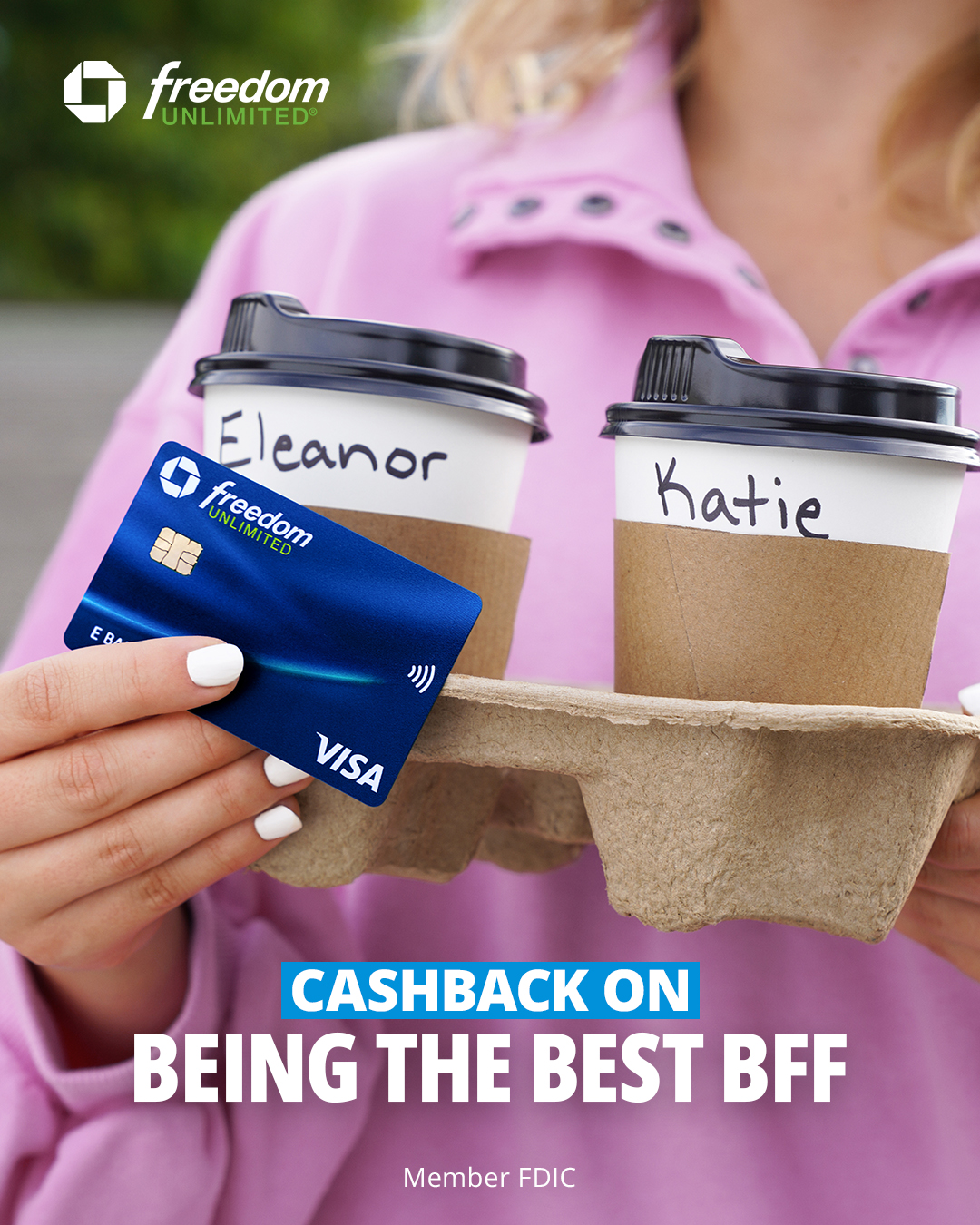
Chase
fintech · neutral plus accent

JobTread Software
saas · monochrome

TravelInsurance.com
insurance · neutral plus accent

WooCommerce
saas · vibrant multi

Shore Excursions Group
travel · neutral plus accent