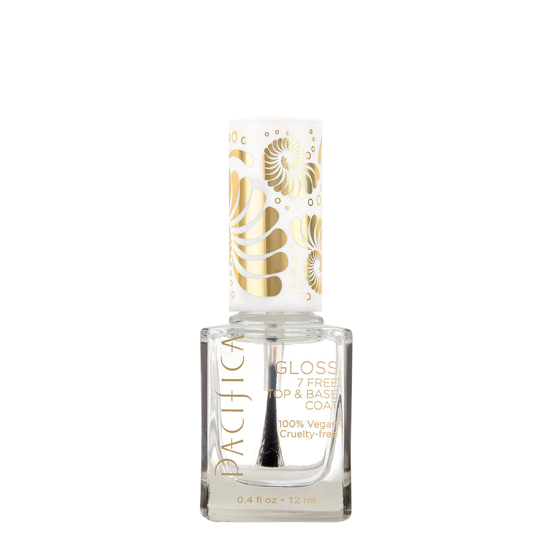
Pacifica
skincare · product-shot
7
craft
The design grammar relies on the contrast between the organic gold illustrations on the cap and the clinical, minimalist typography on the clear glass bottle.
Palette
#ffffff
background · 89.2%
#f1eadd
surface · 2.6%
#dad8d3
neutral · 3.1%
#c5c3bd
neutral · 2.6%
#afaca6
neutral · 0.3%
#bea778
accent · 0.6%
Composition
product hero
Layout
centered
Color structure
neutral plus accent
Background
solid
Typography
sans · sans only
Imagery
product shot · realistic
Temperature
neutral
Accent lands on
logo, typography, illustration
Mood
What makes it work
- Strict vertical symmetry of all elements
- High ratio of negative space to subject
- Metallic gold accents against stark white
- Transparent materials used as a texture
More like this
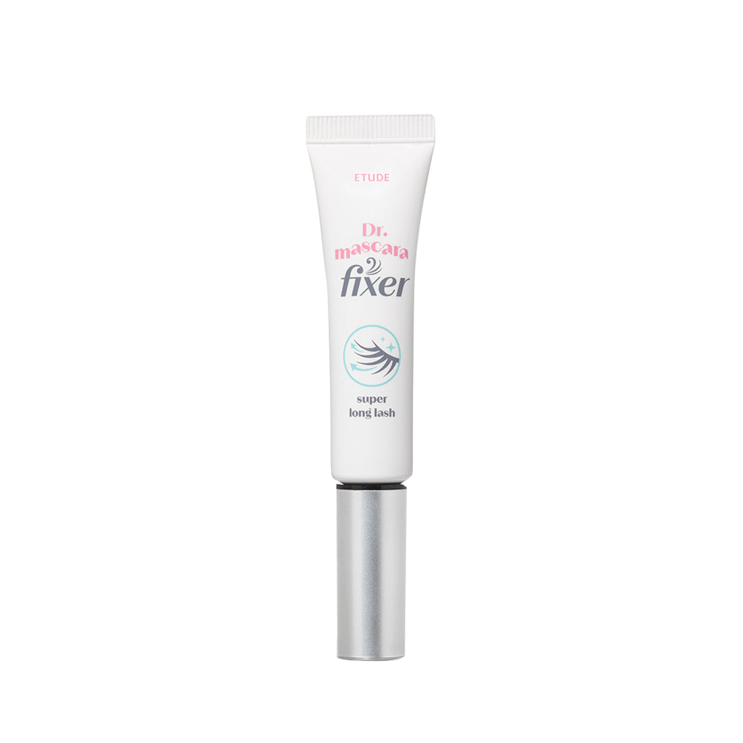
HIKOCO
skincare · monochrome
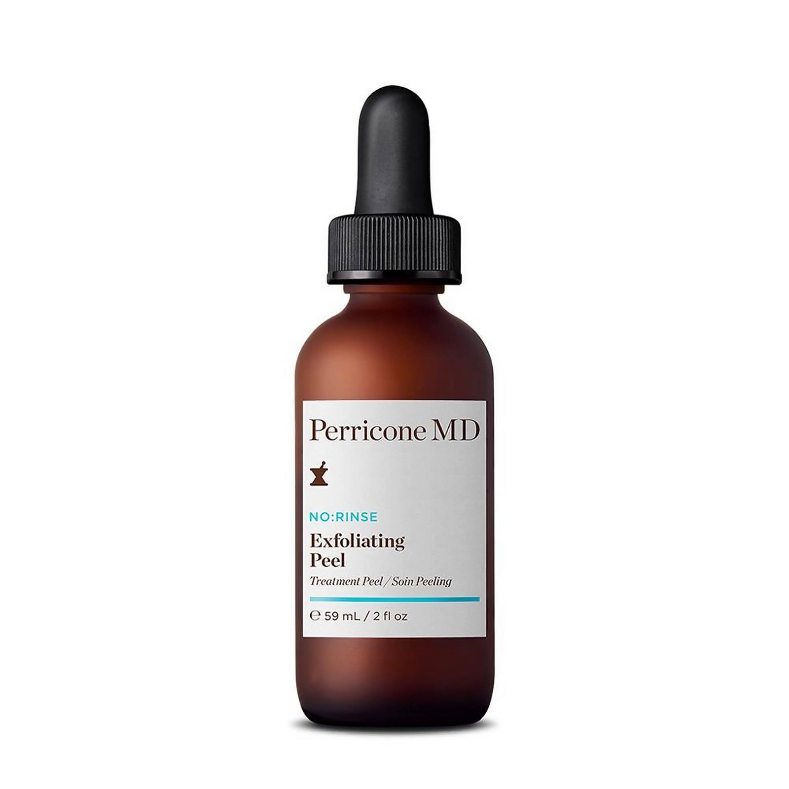
Perricone MD
skincare · monochrome
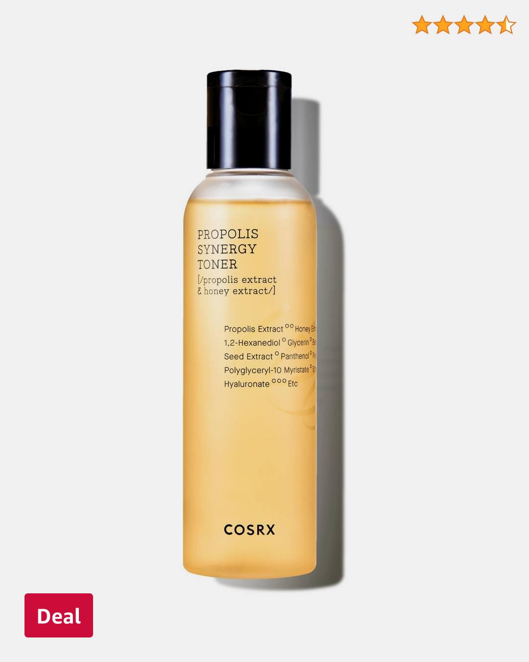
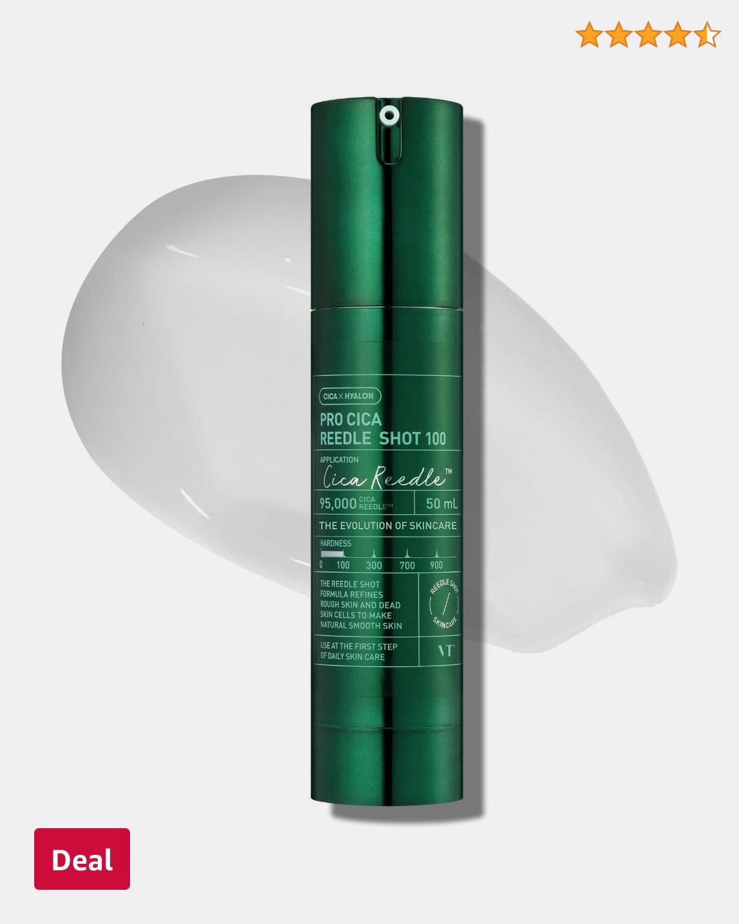
Amazon Beauty
skincare · neutral plus accent
Amazon Beauty
skincare · neutral plus accent
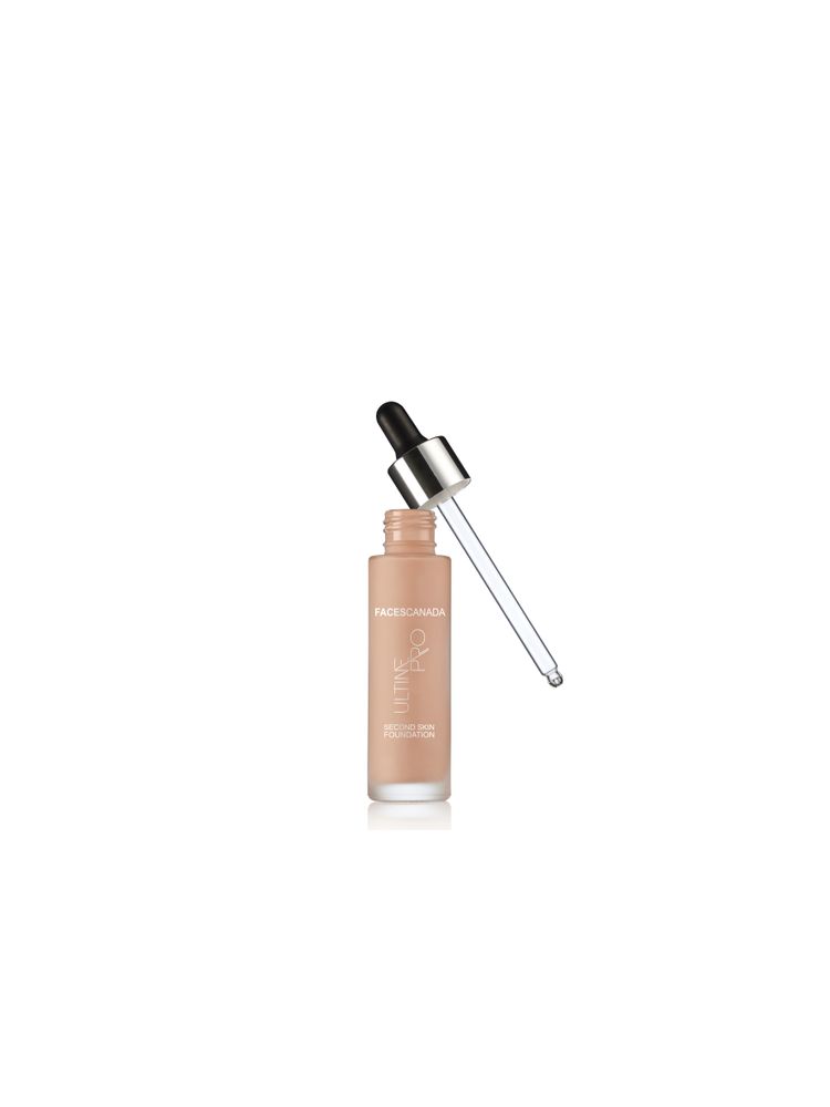
Purplle.com
skincare · neutral plus accent
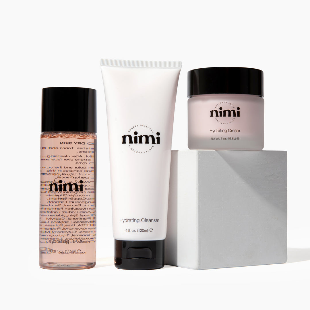
Nimi Skincare
skincare · neutral plus accent
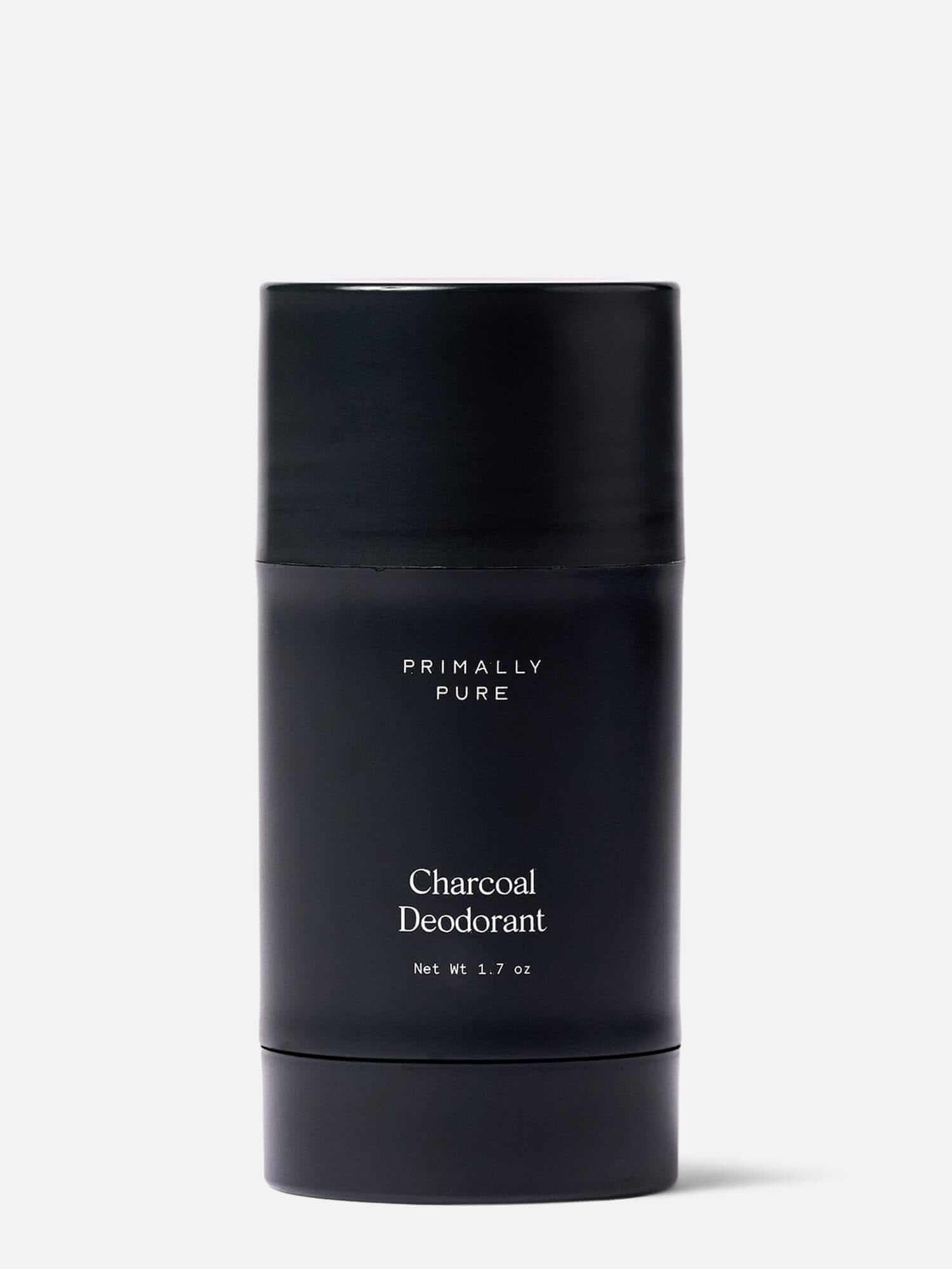
Primally Pure Skincare
skincare · high contrast pair
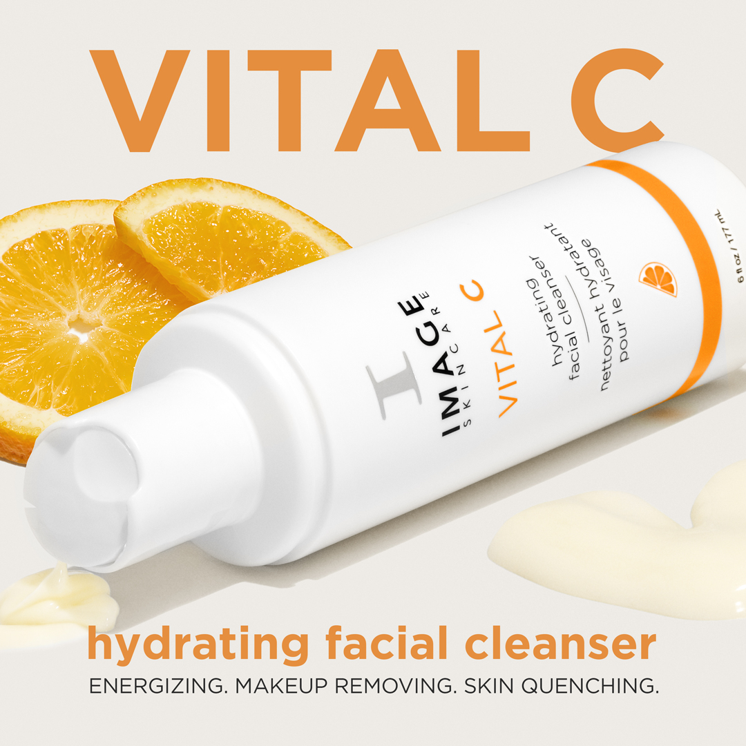
IMAGE Skincare
skincare · neutral plus accent