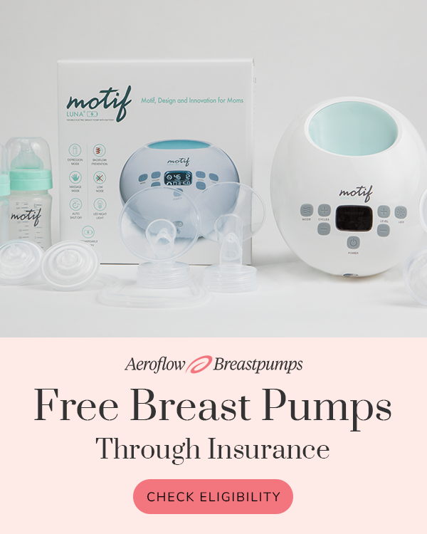
Aeroflow Breastpumps
healthcare · product-shot
6
craft
The design uses a heavy horizontal split to separate the product's physical reality from the brand's promotional offer, using warm neutrals to soften the medical context.
Palette
#d6d6d6
background · 53.7%
#feebe8
surface · 28%
#c1c4c4
neutral · 9.3%
#aba7a6
text · 3.7%
#f3717b
accent · 1.2%
#f8bbbd
secondary · 0.5%
Composition
split panel
Layout
stacked bands
Color structure
neutral plus accent
Background
light panel
Typography
mixed · editorial serif
Imagery
product shot · realistic
Temperature
warm
Accent lands on
cta button, logo icon
Mood
What makes it work
- two-part vertical stack dividing realistic product staging from colored information panel
- large-scale serif typography used for primary headline hierarchy
- saturation strictly reserved for functional call-to-action components
More like this
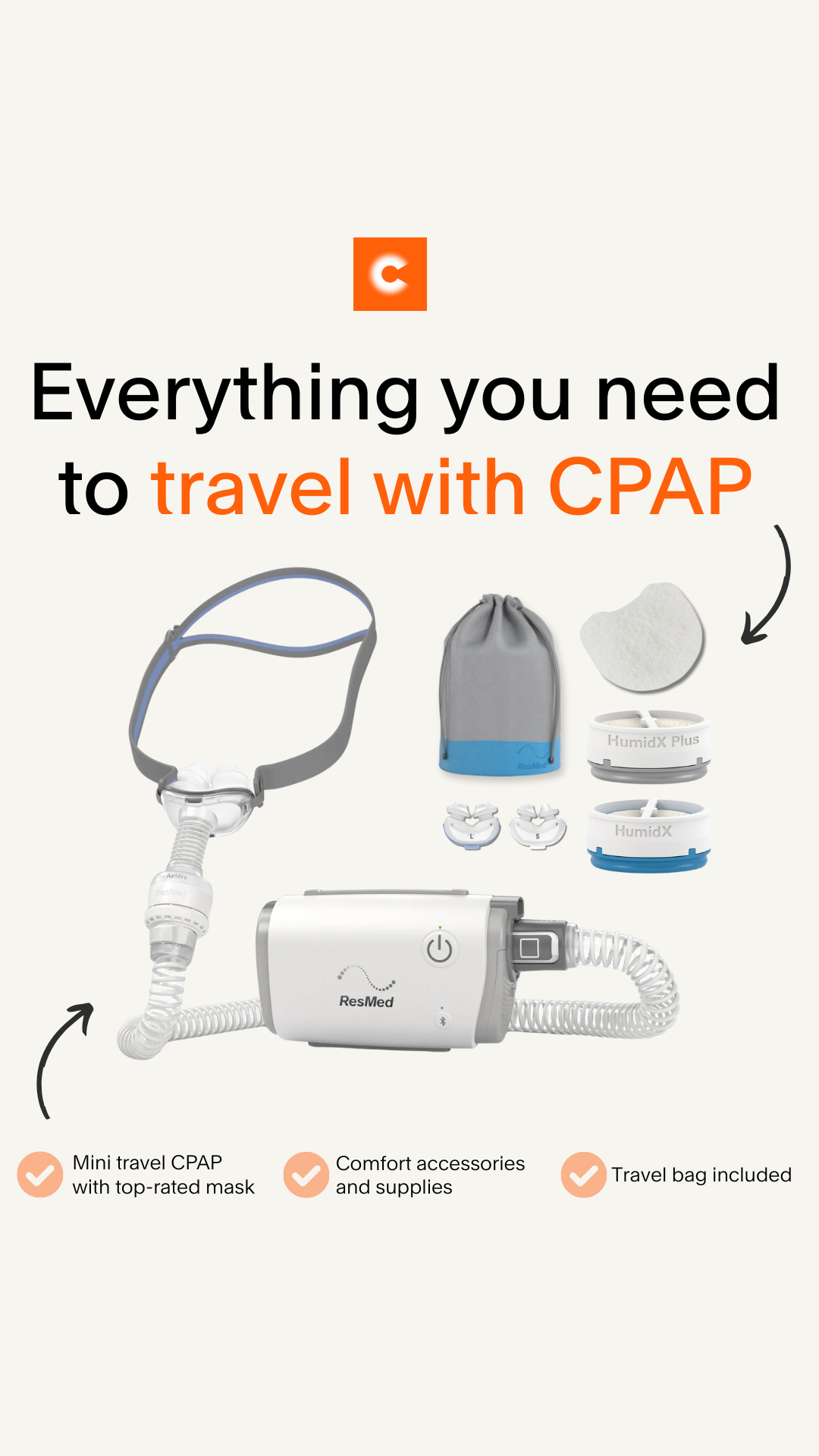
CPAP.com
healthcare · neutral plus accent

1 Natural Way
healthcare · neutral plus accent
Nourish
healthcare · neutral plus accent
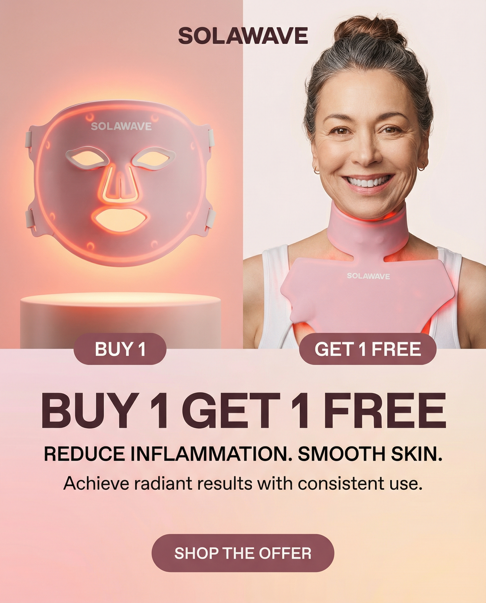
Solawave
skincare · muted earthy
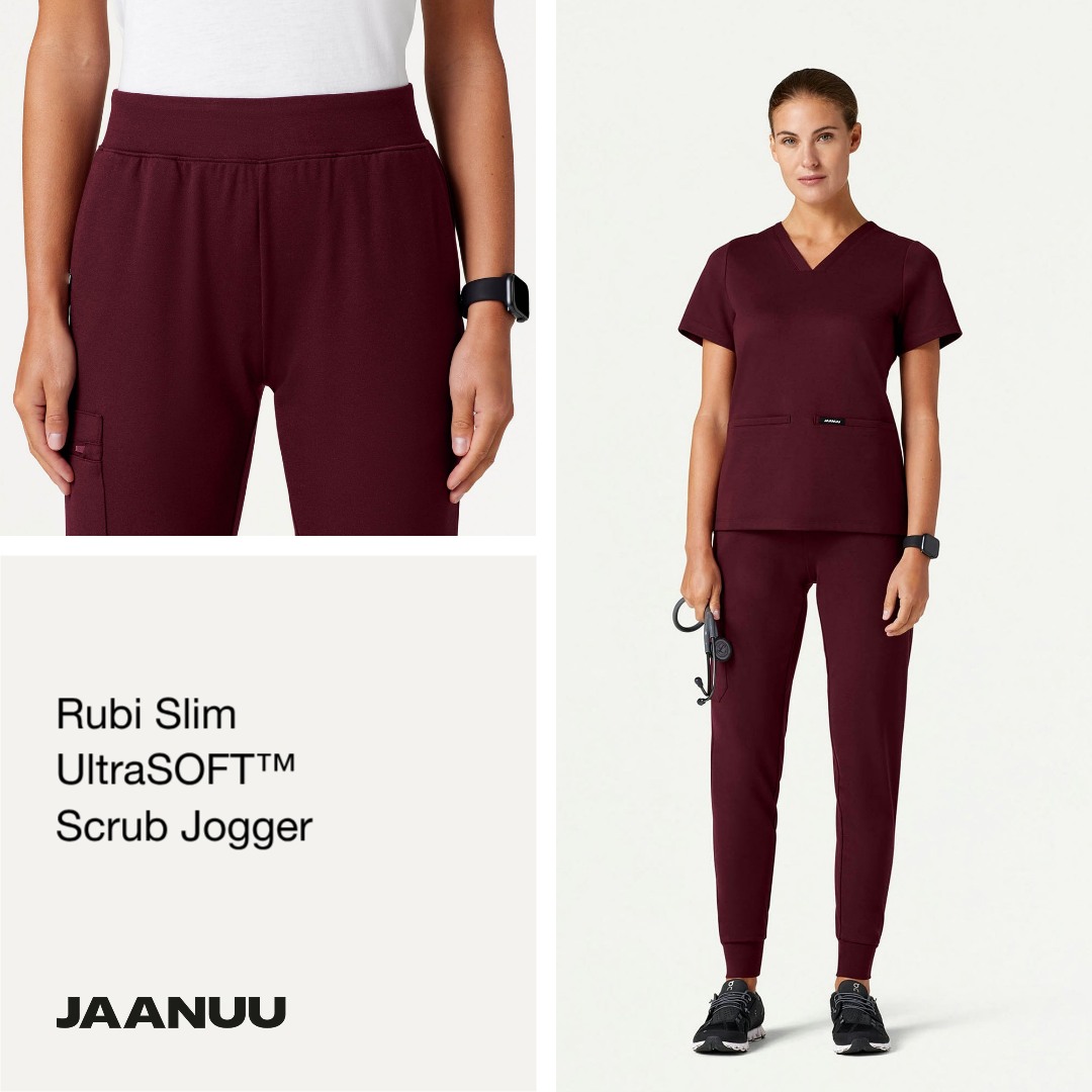
Jaanuu
healthcare · neutral plus accent
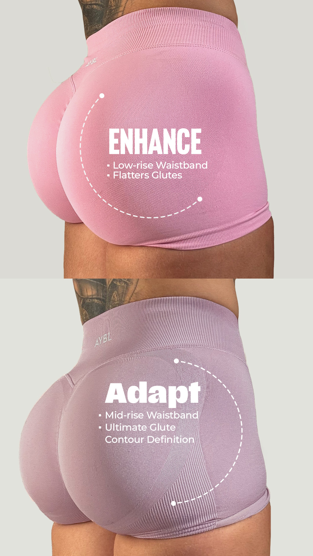
AYBL
fitness · muted earthy

Valleywise Health
healthcare · neutral plus accent

Graco Children's Products
other · neutral plus accent