Nourish
healthcare · image
7
craft
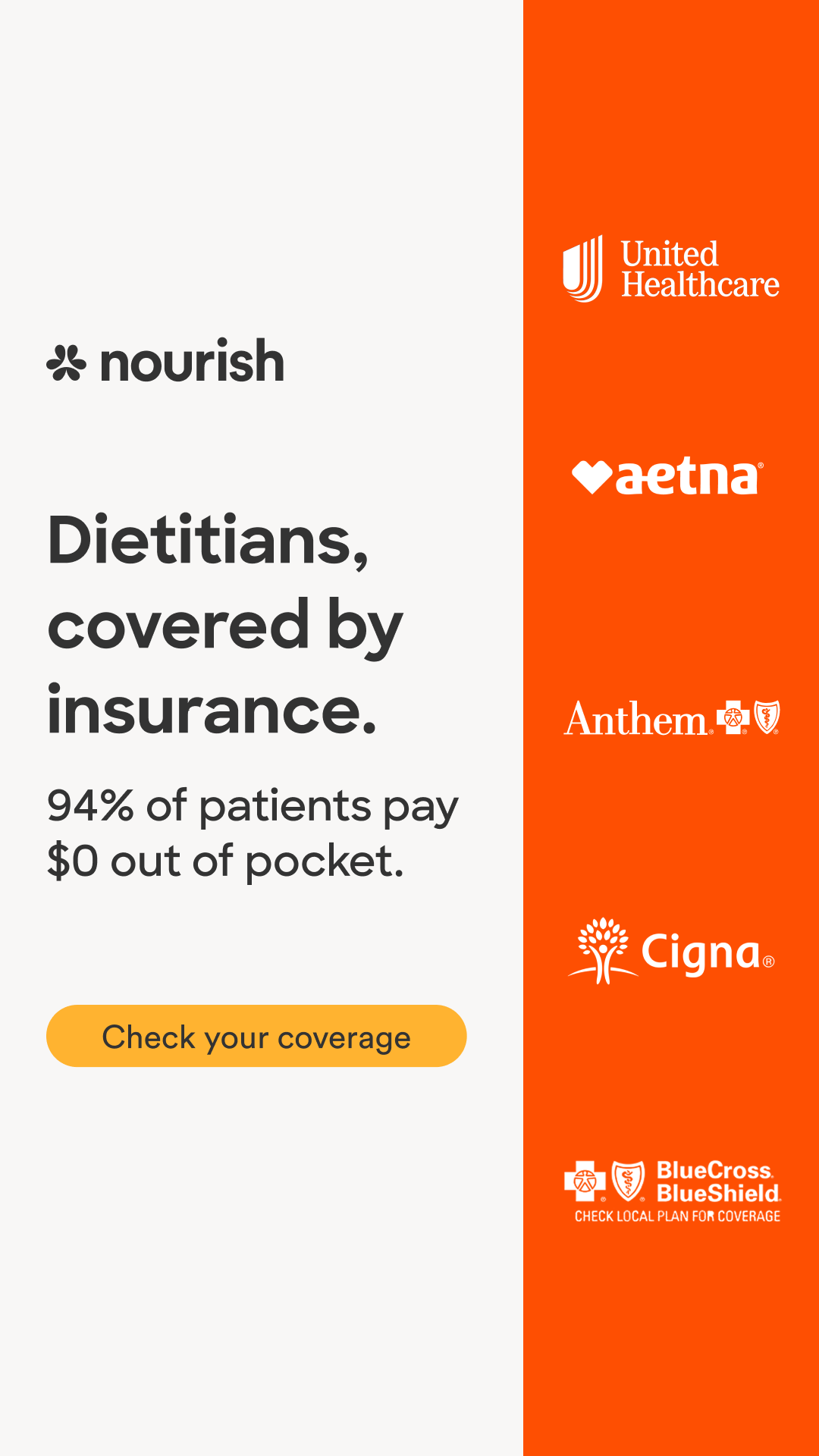
The layout uses a stark vertical division to separate the value proposition from the trust-building partner logos.
Palette
#f8f7f5
background · 53.2%
#fe4e02
surface · 31.1%
#fba37c
accent · 2.6%
#d8d7d6
neutral · 1.9%
#a8a7a7
neutral · 1.6%
#bfbfbe
neutral · 1.4%
Composition
split panel
Layout
asymmetric
Color structure
neutral plus accent
Background
solid
Typography
sans · sans only
Imagery
typographic only · none
Temperature
warm
Accent lands on
cta button
Mood
What makes it work
- asymmetric vertical split with high-contrast accent panel
- pill-shaped cta button
- left-aligned typographic hierarchy
- stacked monochromatic partner logos in secondary panel
More like this
Nourish
healthcare · neutral plus accent
Nourish
fitness · high contrast pair

APN Lodge
healthcare · neutral plus accent
Nourish
healthcare · neutral plus accent
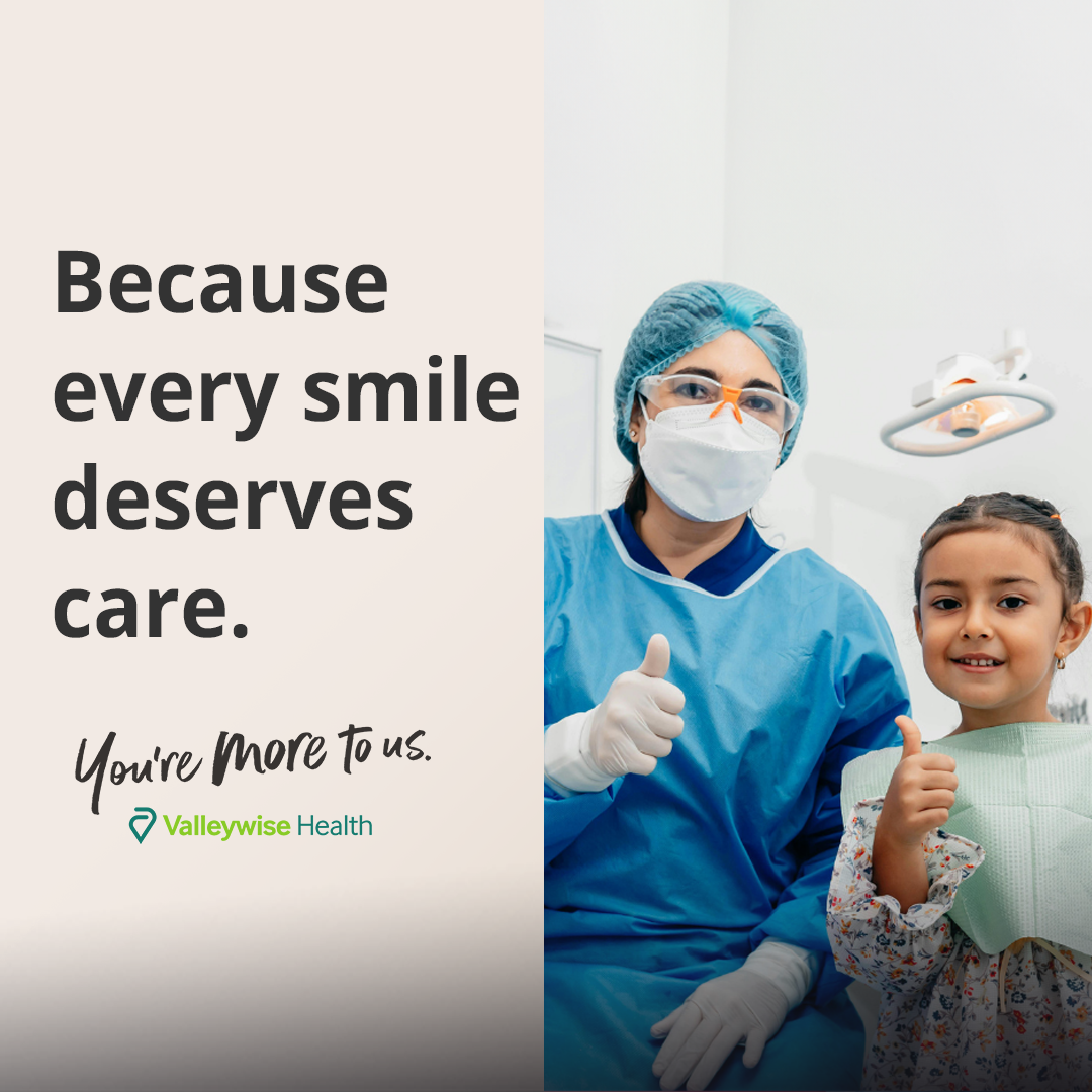
Valleywise Health
healthcare · neutral plus accent
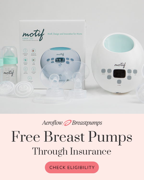
Aeroflow Breastpumps
healthcare · neutral plus accent
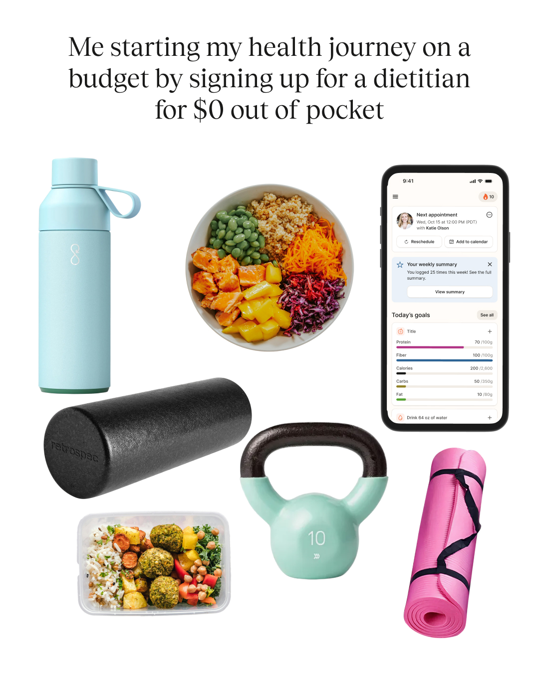
Nourish
fitness · neutral plus accent
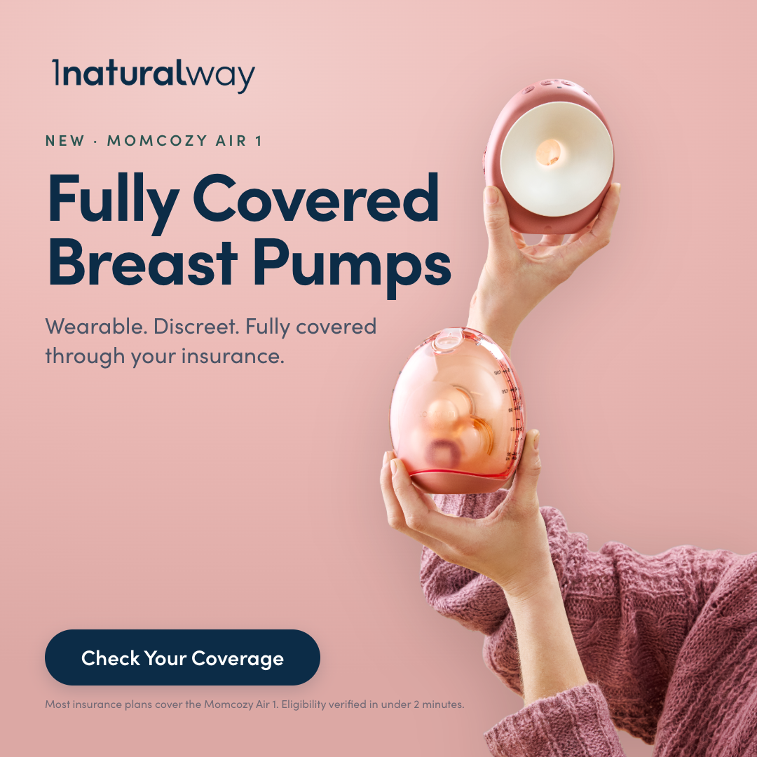
1 Natural Way
healthcare · neutral plus accent