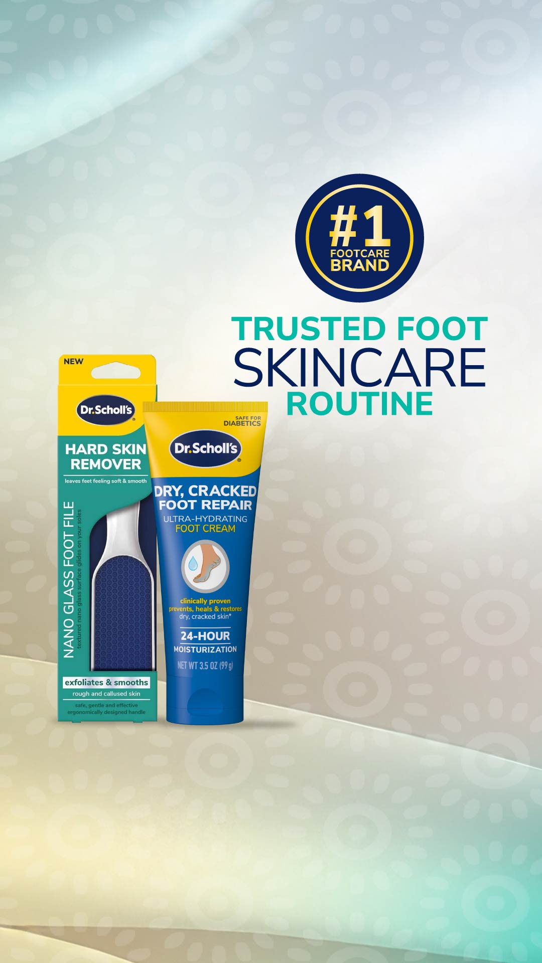
Dr. Scholl's
skincare · product-shot
5
craft
The design uses a palette of low-saturation greens and greys to establish a medical/hygienic tone, punctuated by a singular high-contrast navy for branding and hierarchy.
Palette
#eff1ee
background · 21.6%
#d5dcd9
surface · 27.3%
#c3bba9
secondary · 16.9%
#f1eac2
neutral · 4.1%
#c3d0c4
neutral · 4.3%
#00447b
accent · 0.3%
Composition
headline plus visual
Layout
asymmetric
Color structure
neutral plus accent
Background
pattern
Typography
sans · sans only
Imagery
product shot · realistic
Temperature
cool
Accent lands on
badge, headline, logo
Mood
What makes it work
- Repeating radial pattern in background used for clinical texture
- High contrast navy typography against desaturated sage surfaces
- Asymmetric layout weighting products to the left and trust signals to the right
- Heavy use of uppercase geometric sans-serif to imply medical efficacy
More like this
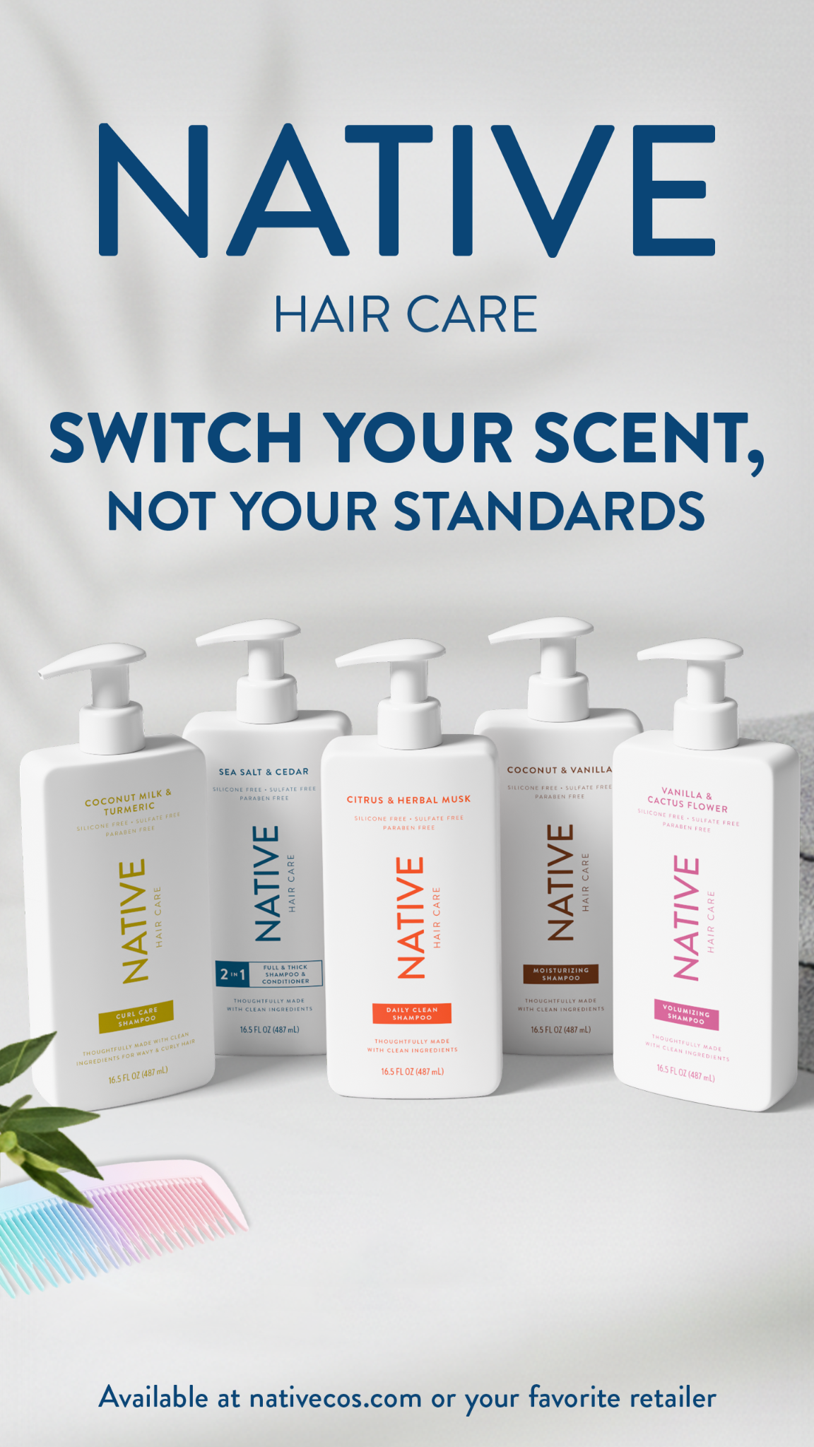
Native
skincare · neutral plus accent
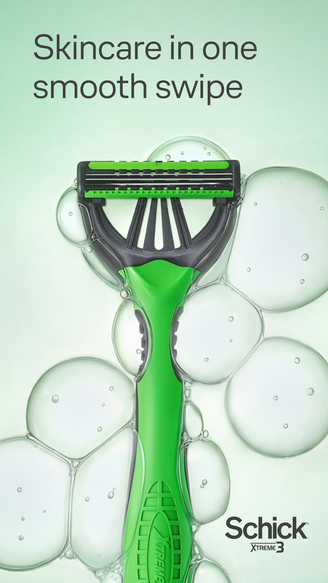
Schick
skincare · neutral plus accent
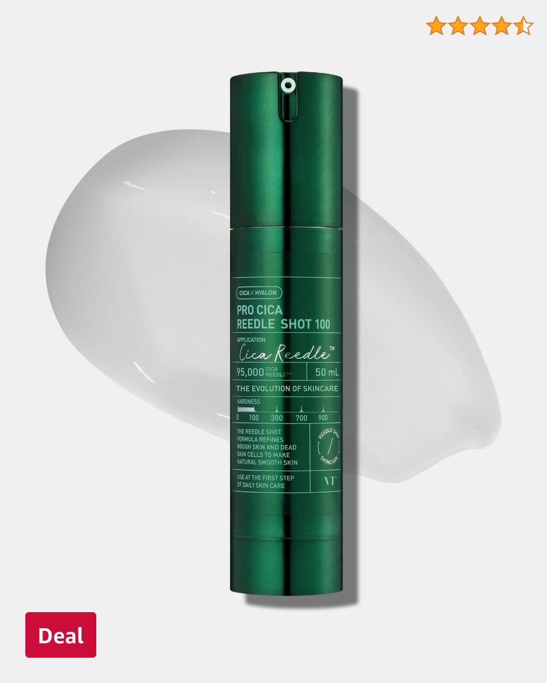
Amazon Beauty
skincare · neutral plus accent
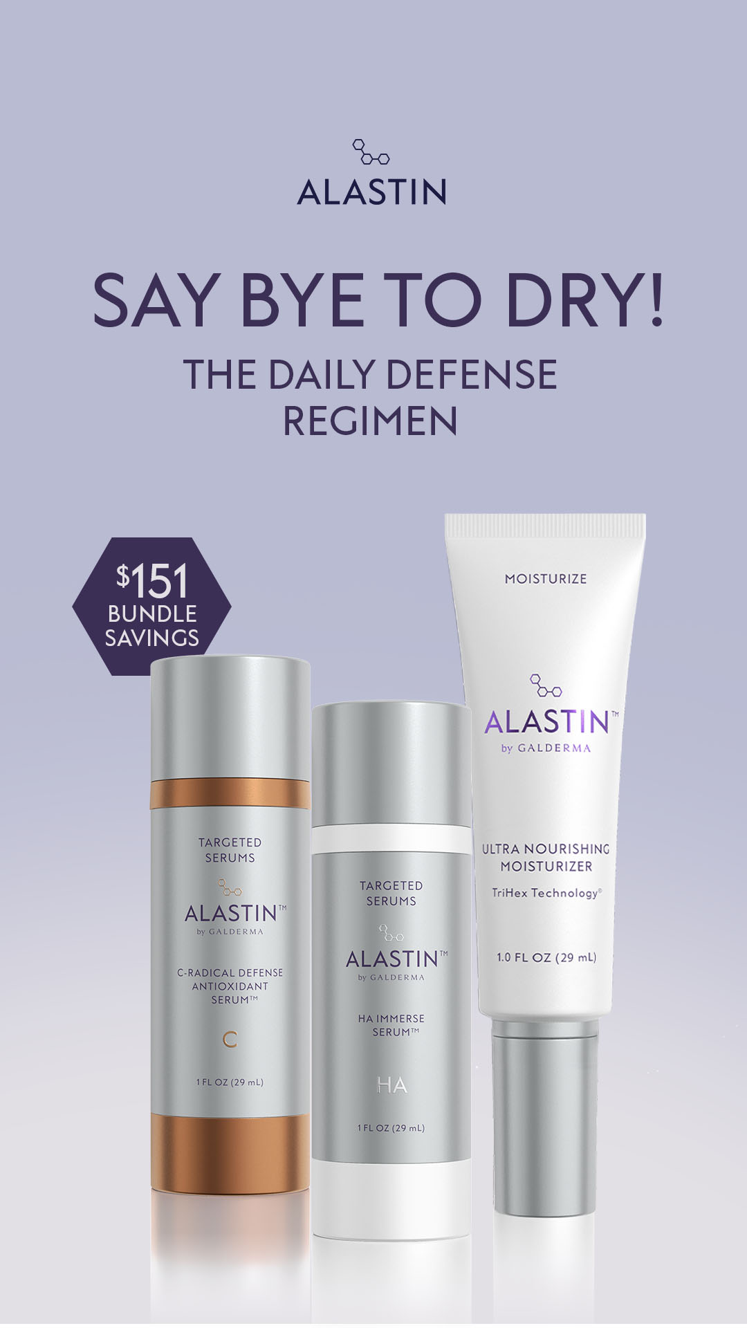
Alastin Skincare
skincare · neutral plus accent
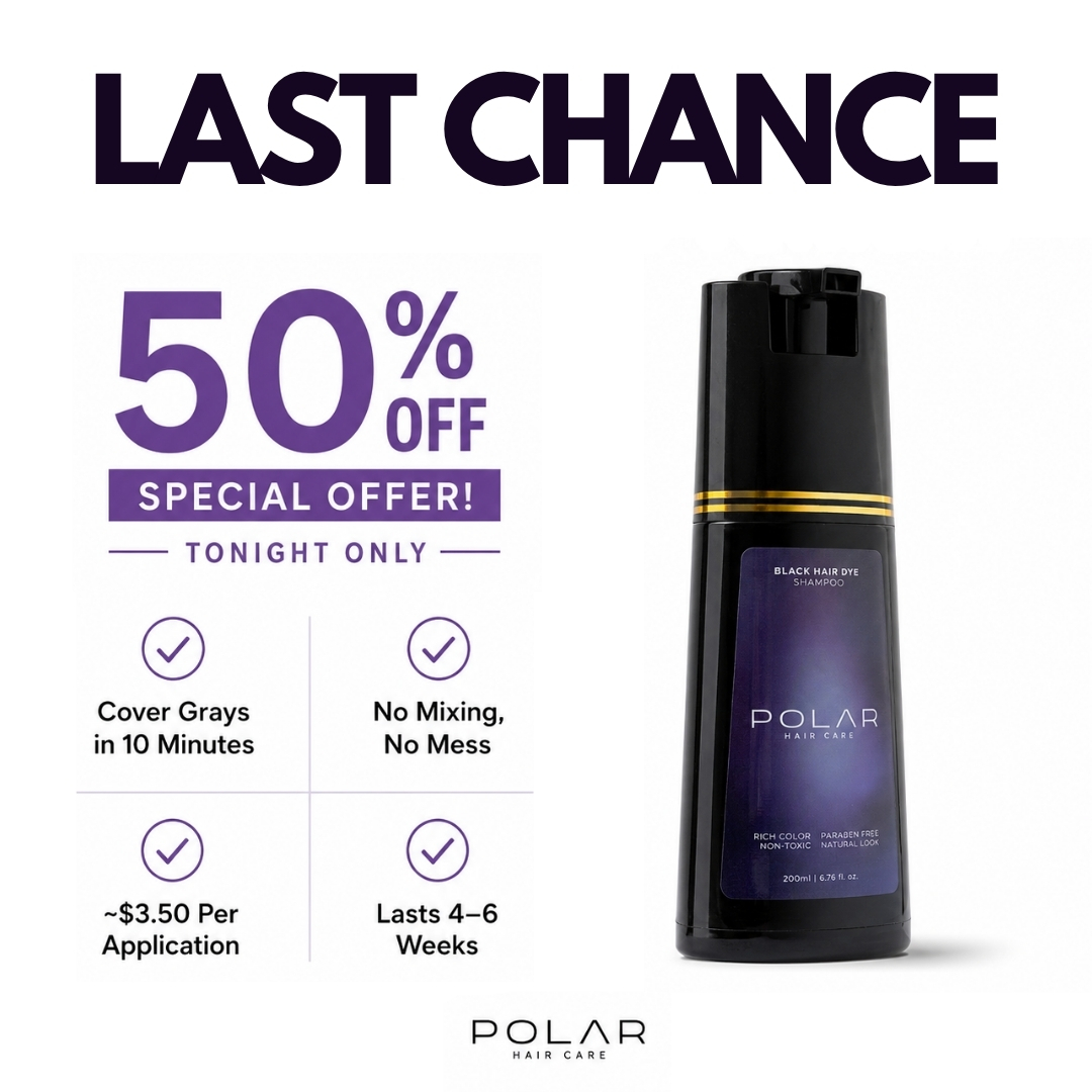
Polar Haircare
skincare · neutral plus accent
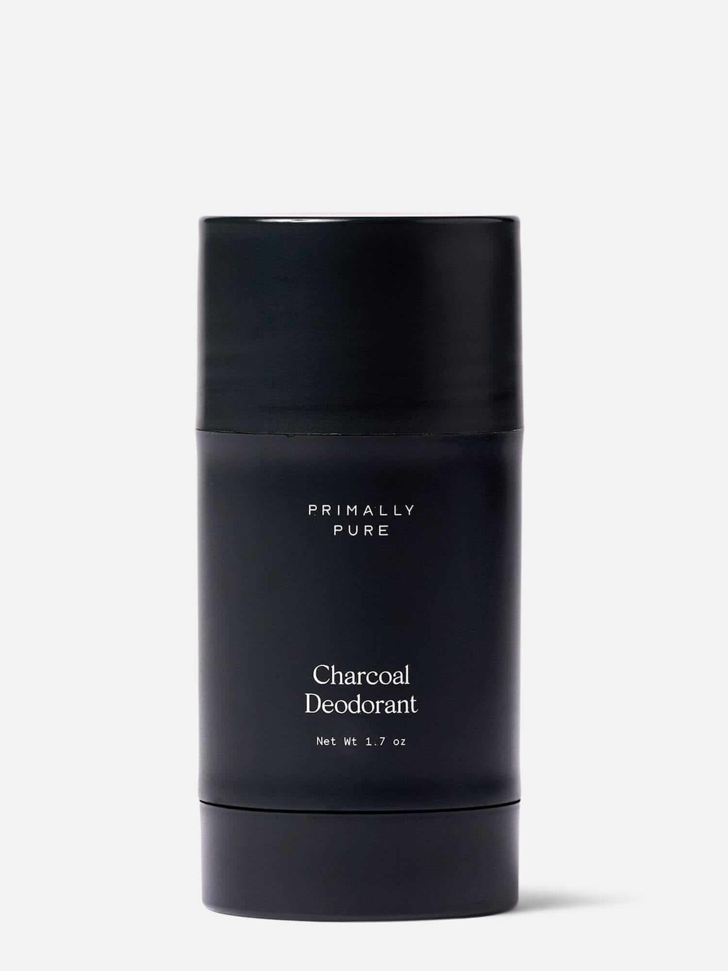
Primally Pure Skincare
skincare · high contrast pair
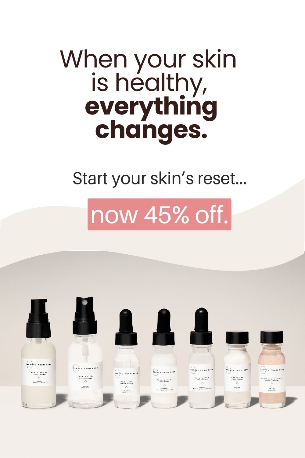
Beauty From Bees
skincare · neutral plus accent
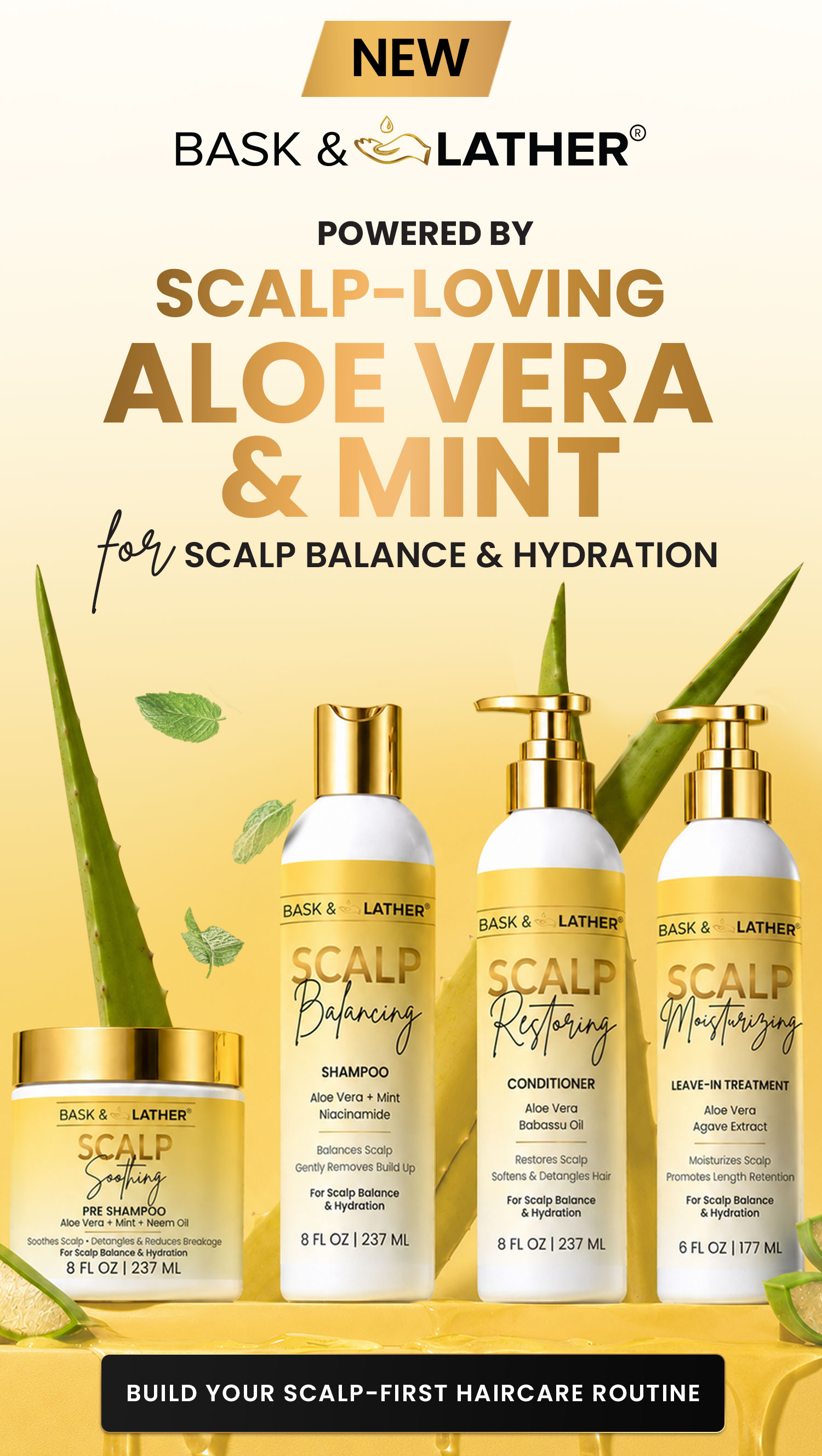
Bask & Lather Co
skincare · analogous blend