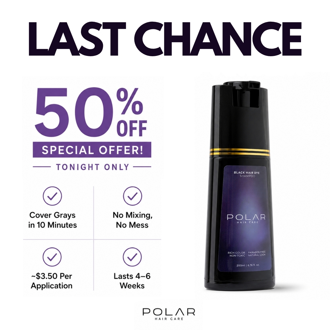
Polar Haircare
skincare · product-shot
6
craft
The design utilizes a strict white field to maintain high contrast, directing attention to the product via an asymmetric layout where text and imagery share equal vertical weighting.
Palette
#fefefe
background · 71.5%
#d9d6db
neutral · 3.7%
#050406
text · 3.7%
#2e2e30
secondary · 3.3%
#161617
surface · 2.5%
#5e3687
accent · 1.1%
Composition
product hero
Layout
asymmetric
Color structure
neutral plus accent
Background
solid
Typography
sans · sans only
Imagery
product shot · realistic
Temperature
cool
Accent lands on
offer text, badge background, icon outlines
Mood
What makes it work
- Vertical asymmetric split separating promotional offer from product shot
- Purple used exclusively for semantic signaling of value and priority
- High-contrast black sans-serif for urgent primary messaging
- 2x2 grid for structured benefit communication
More like this
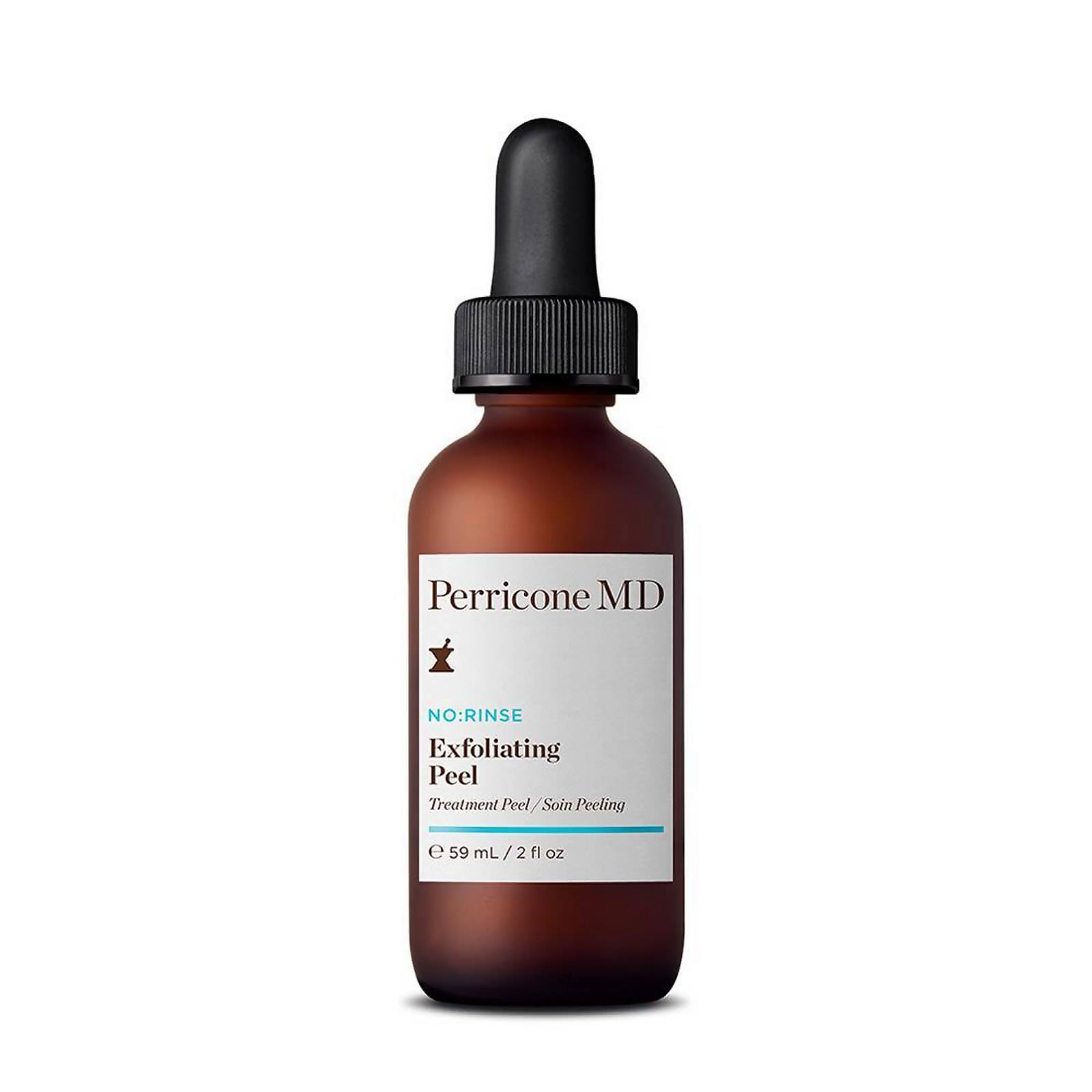
Perricone MD
skincare · monochrome
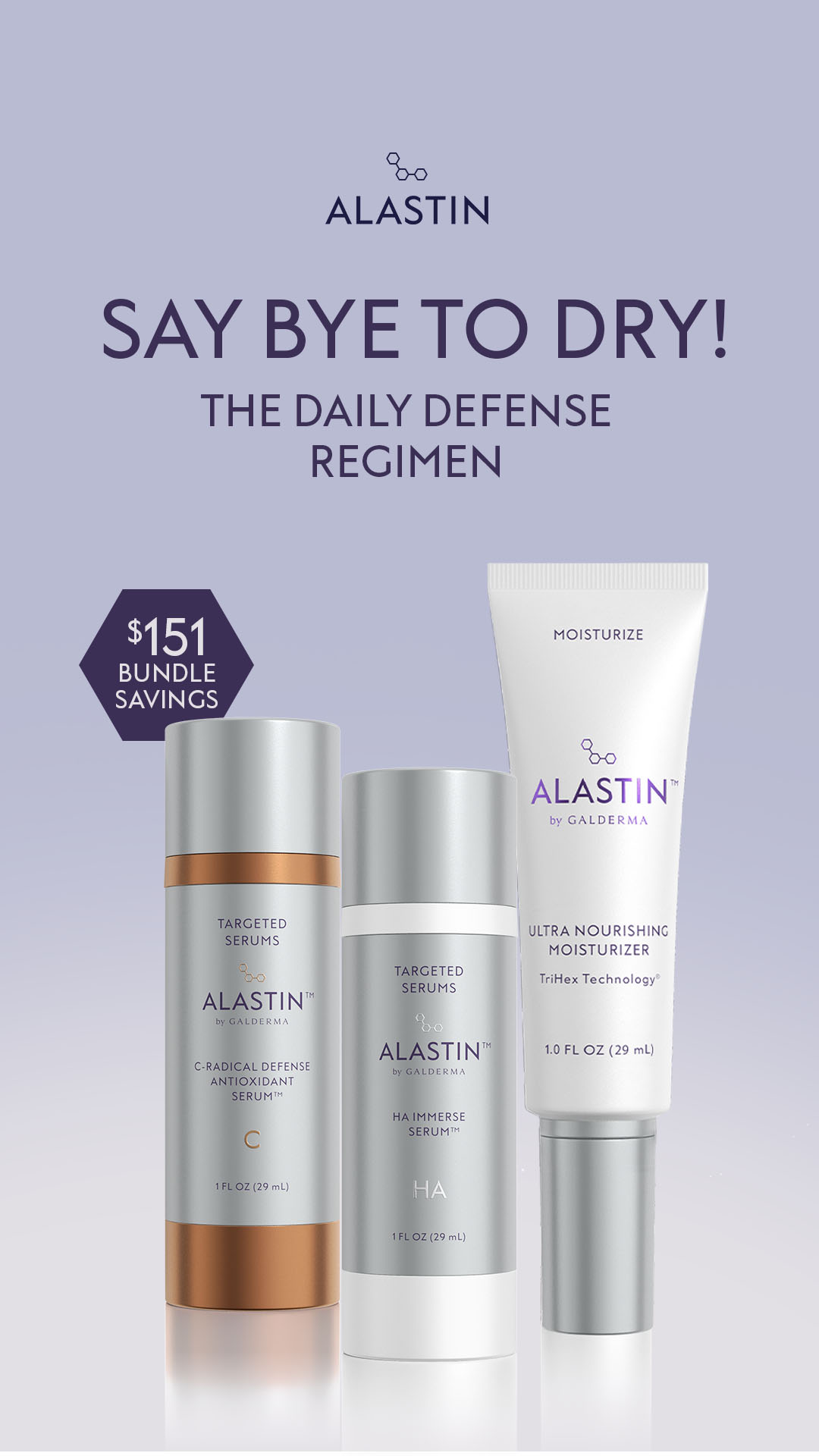
Alastin Skincare
skincare · neutral plus accent
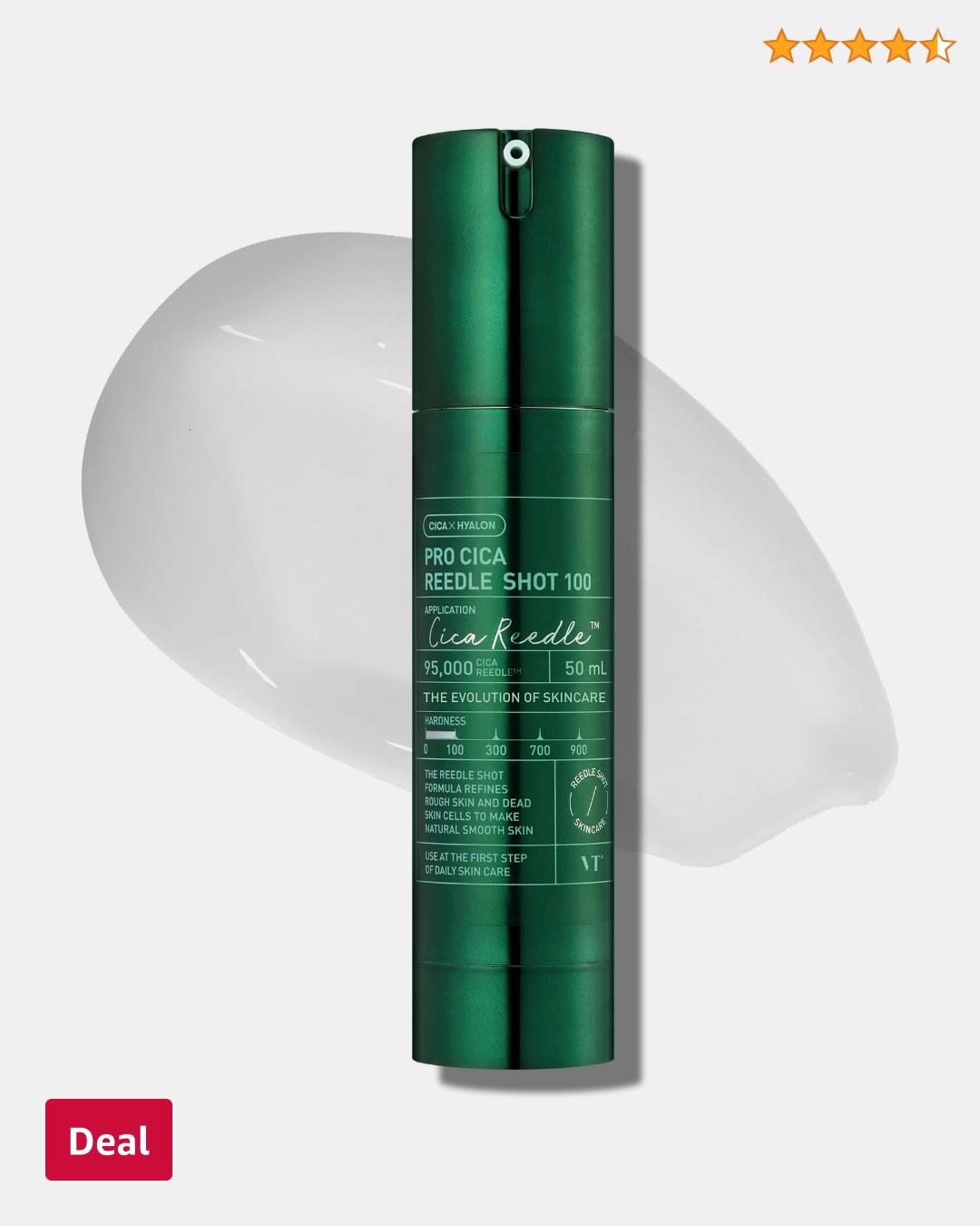
Amazon Beauty
skincare · neutral plus accent
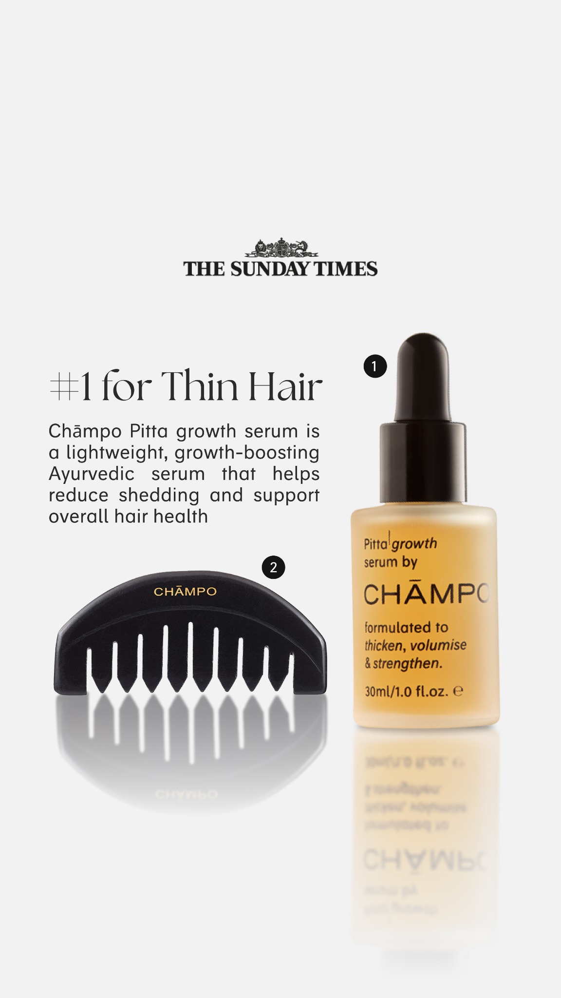
Chāmpo Haircare
skincare · neutral plus accent
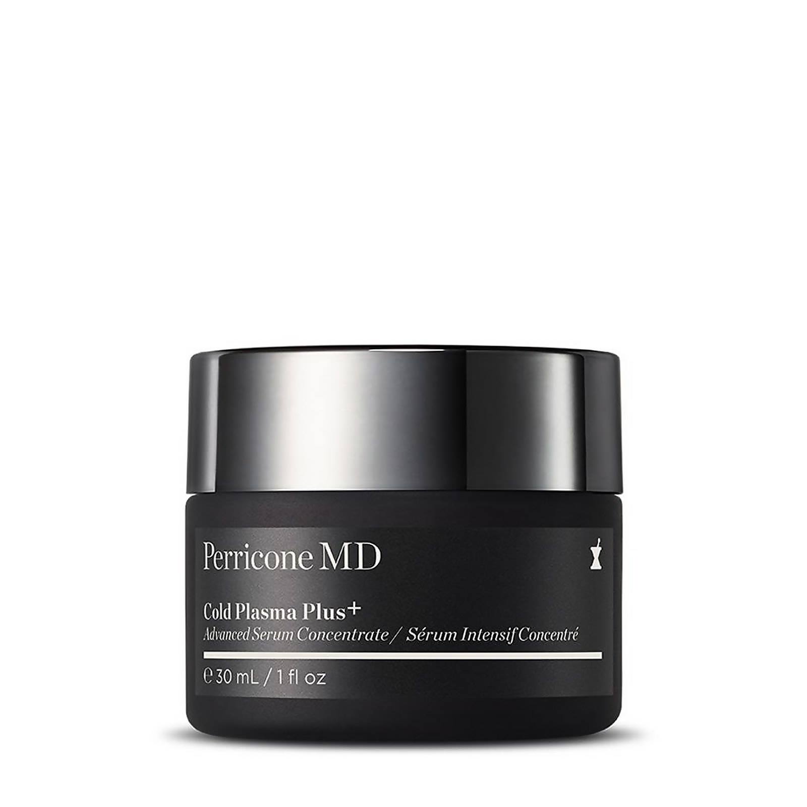
Perricone MD
skincare · neutral plus accent
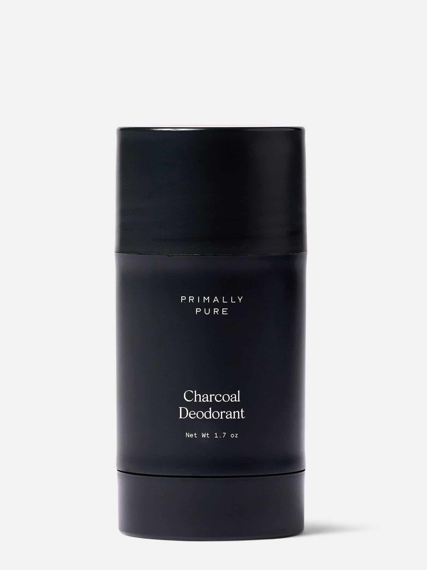
Primally Pure Skincare
skincare · high contrast pair
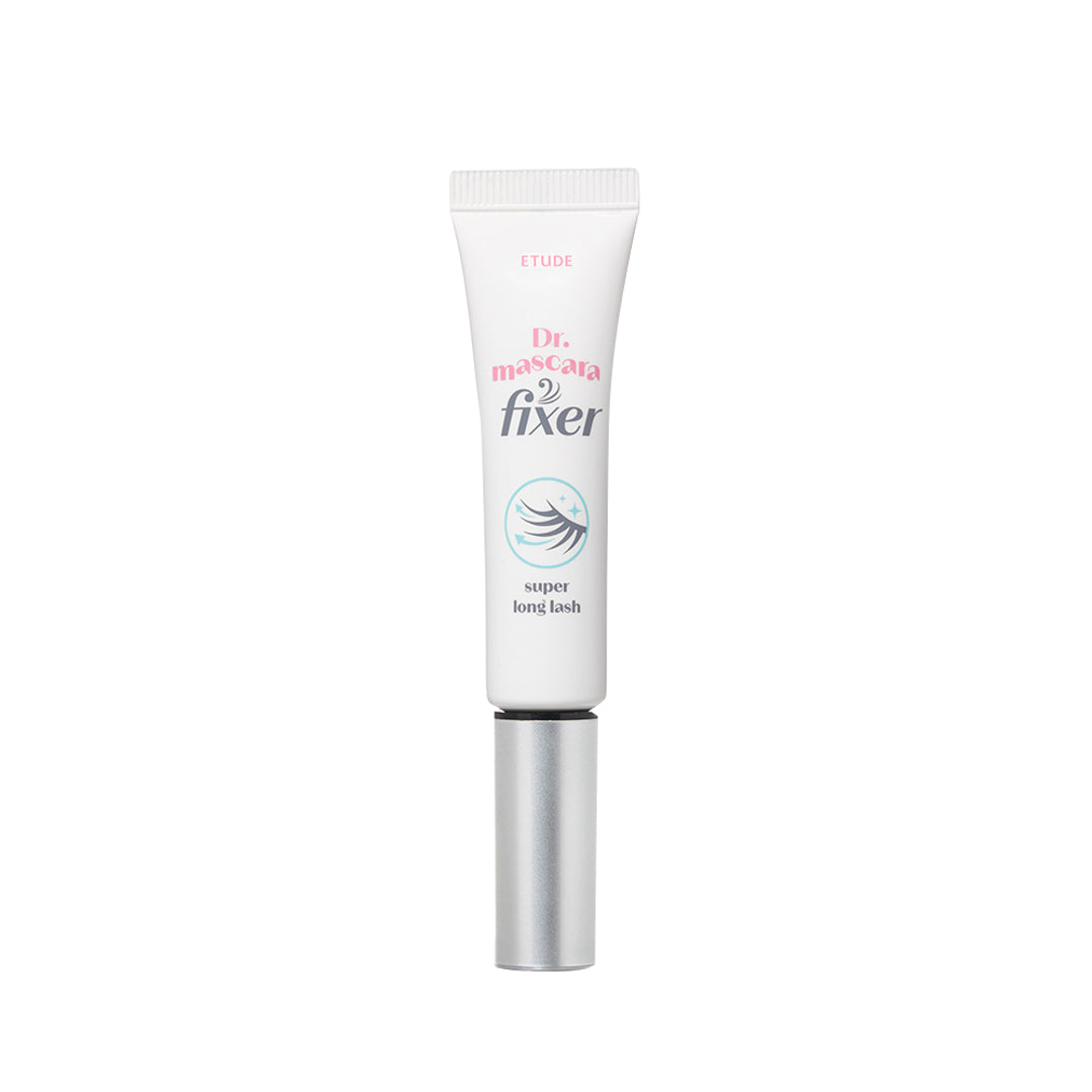
HIKOCO
skincare · monochrome
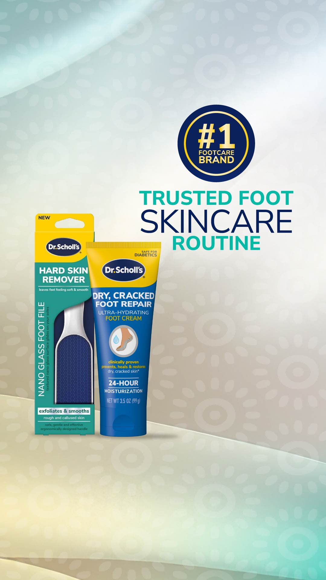
Dr. Scholl's
skincare · neutral plus accent