Nourish
healthcare · image
6
craft
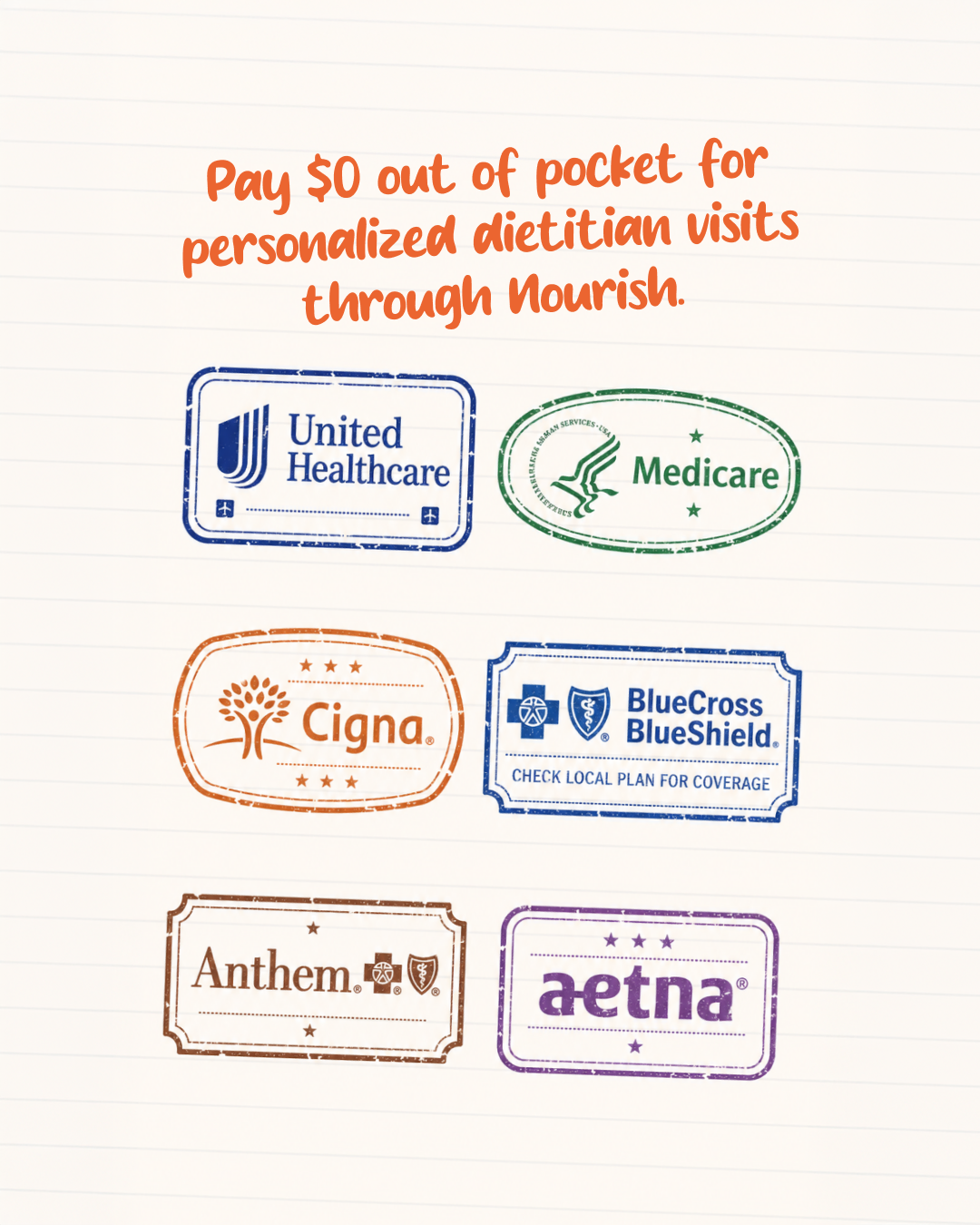
The design leverages a 'notebook' metaphor to make insurance-related information feel personal, tactile, and less institutional.
Palette
#fdf8f3
background · 80%
#f1ded4
surface · 4.5%
#d5d8dc
neutral · 2.4%
#f1c1a8
secondary · 2%
#bfc2d6
secondary · 2.4%
#ed7a4c
accent · 0.3%
Composition
headline plus visual
Layout
centered
Color structure
neutral plus accent
Background
textured
Typography
sans · display plus sans
Imagery
flat illustration · flat
Temperature
warm
Accent lands on
headline
Mood
What makes it work
- Distressed ink stamp treatment for partner logos
- Handwritten-style display typography for primary value proposition
- Subtle horizontal notebook rule background texture
- Symmetrical grid arrangement of secondary brand assets
More like this
Nourish
healthcare · neutral plus accent

APN Lodge
healthcare · neutral plus accent
CPAP.com
healthcare · neutral plus accent

TravelInsurance.com
insurance · neutral plus accent
1 Natural Way
healthcare · neutral plus accent
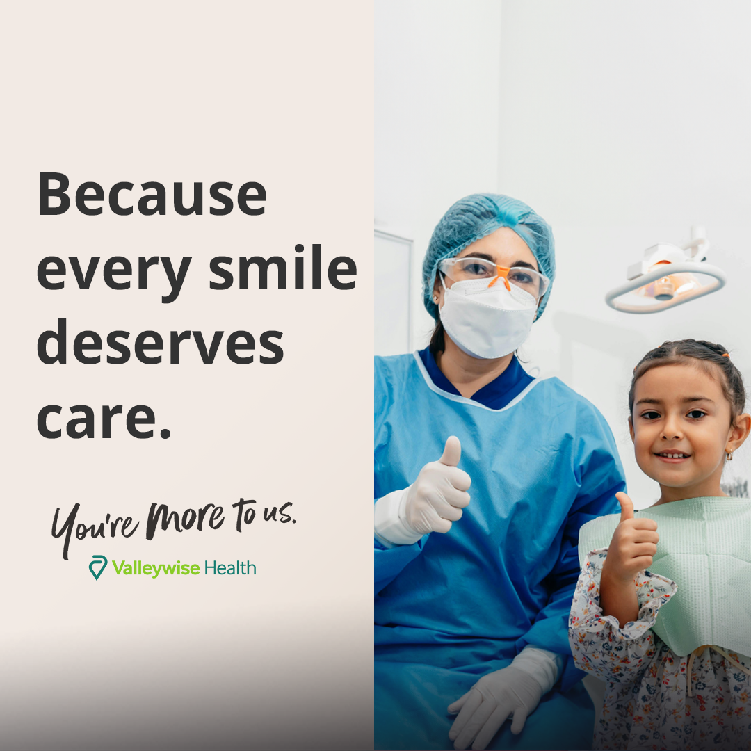
Valleywise Health
healthcare · neutral plus accent
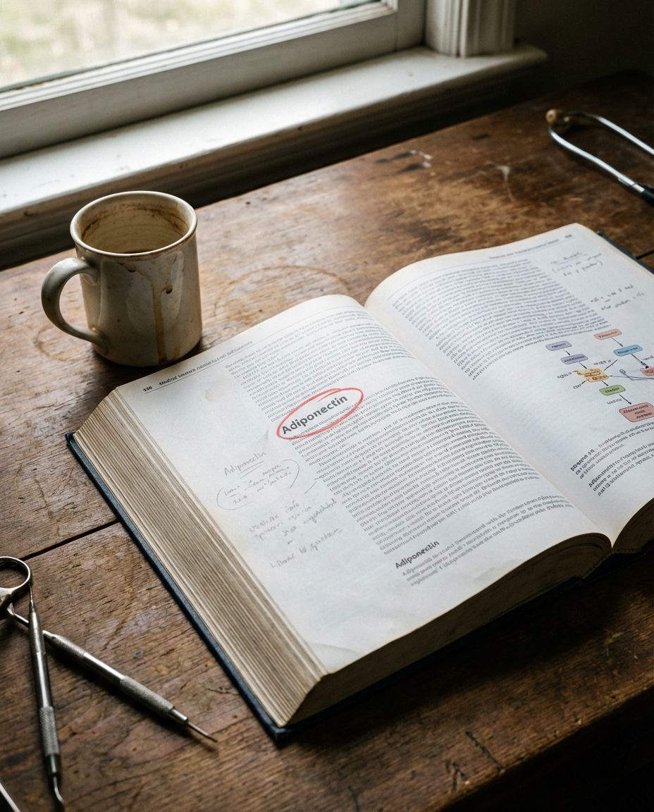
American Health Support Community
healthcare · muted earthy
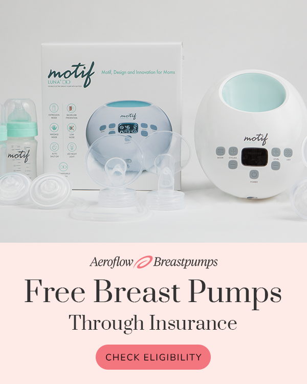
Aeroflow Breastpumps
healthcare · neutral plus accent