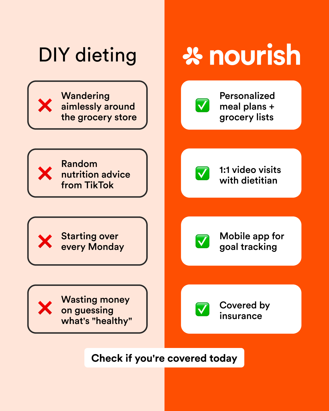
Nourish
fitness · image
7
craft
Design relies on chromatic signaling (warm neutral vs vivid brand color) to subconsciously validate the right-hand column.
Palette
#ffe7da
background · 37.1%
#fe4d02
accent · 26.2%
#fffffe
surface · 11.7%
#bfada4
text · 6.2%
#d8c3b9
secondary · 4.5%
#ebd3c8
neutral · 2.8%
Composition
split panel
Layout
stacked bands
Color structure
high contrast pair
Background
solid
Typography
sans · sans only
Imagery
flat illustration · flat
Temperature
warm
Accent lands on
right panel, brand logo
Mood
What makes it work
- Vertical bisection separating problem from solution space
- Repetitive card modules for feature comparison
- High-saturation orange reserved strictly for brand-side success states
More like this
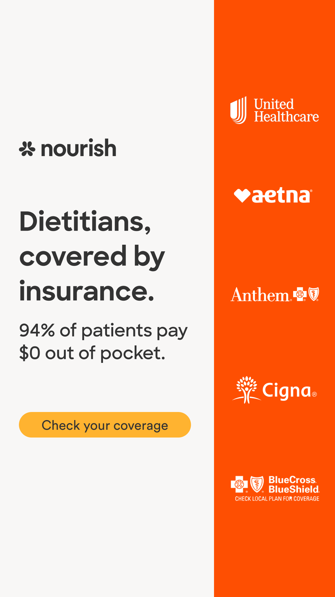
Nourish
healthcare · neutral plus accent
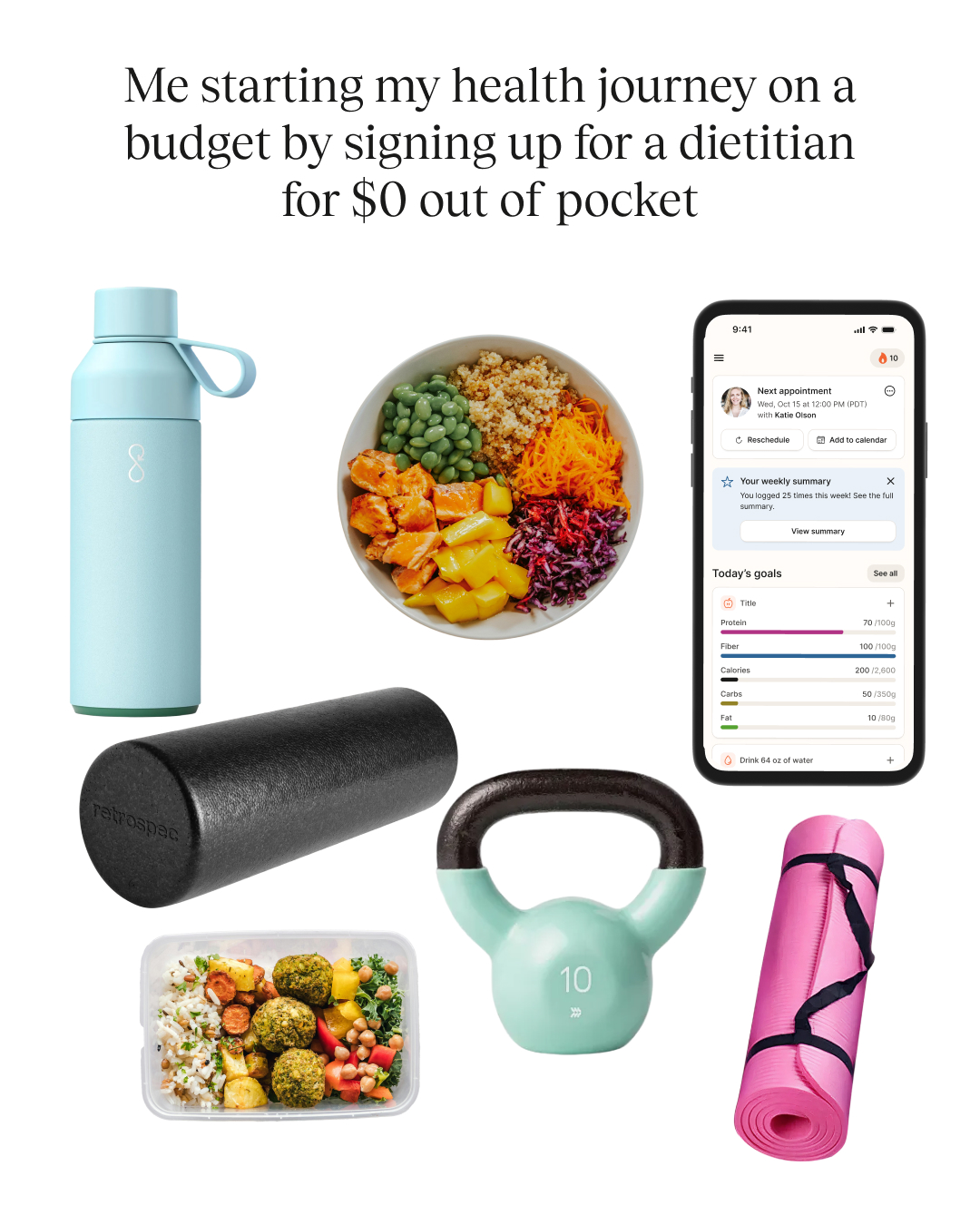
Nourish
fitness · neutral plus accent
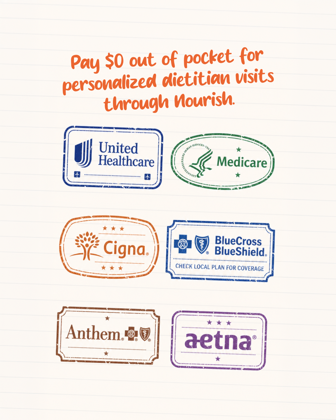
Nourish
healthcare · neutral plus accent
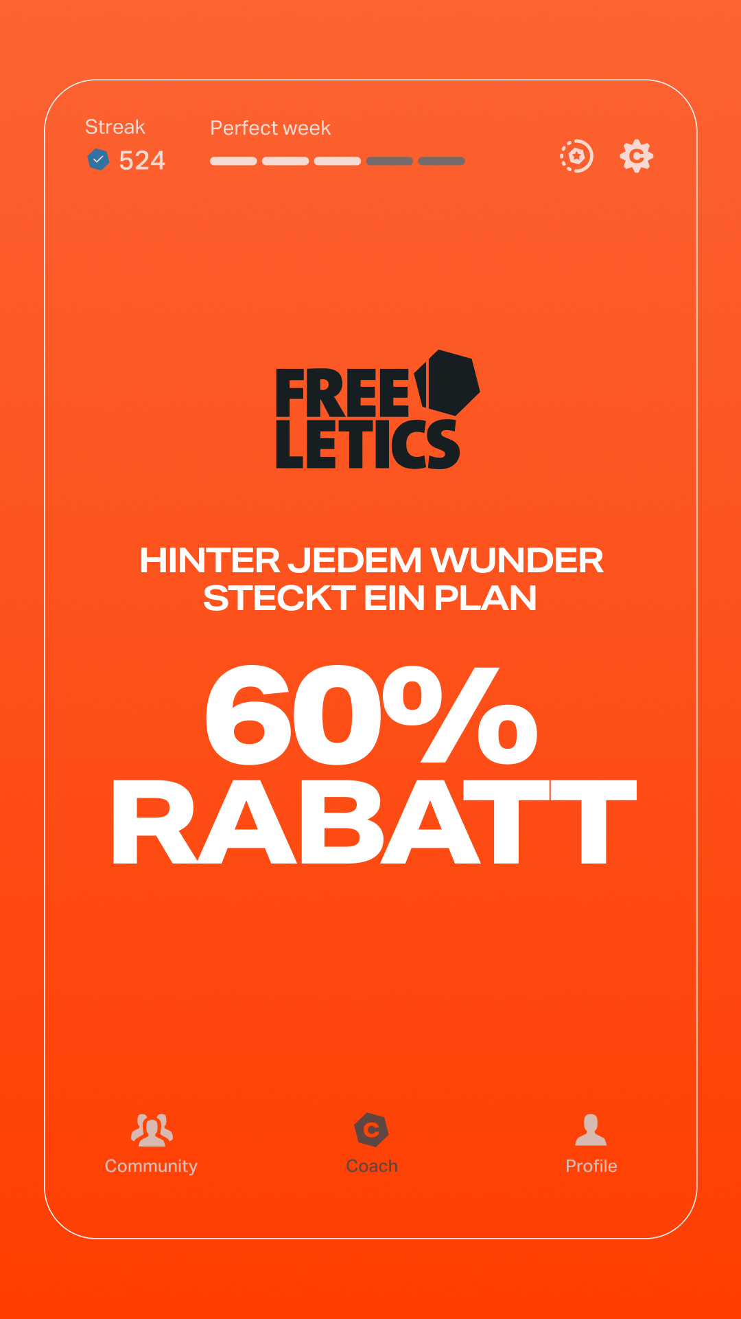
Freeletics
fitness · analogous blend
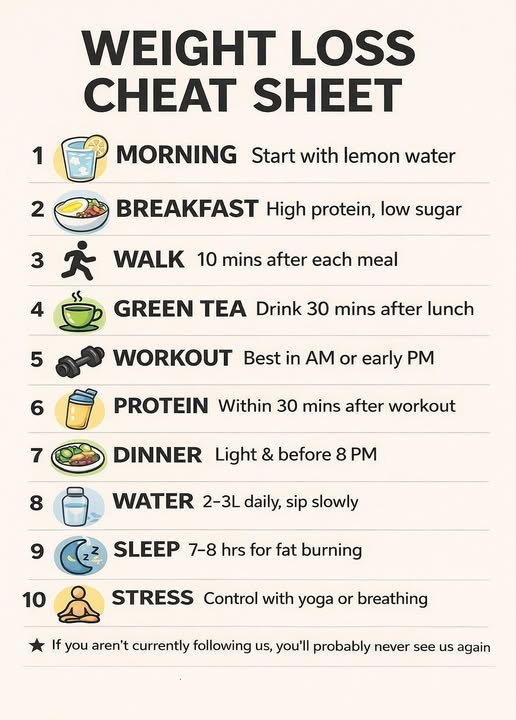
Nandy Yoga
fitness · neutral plus accent
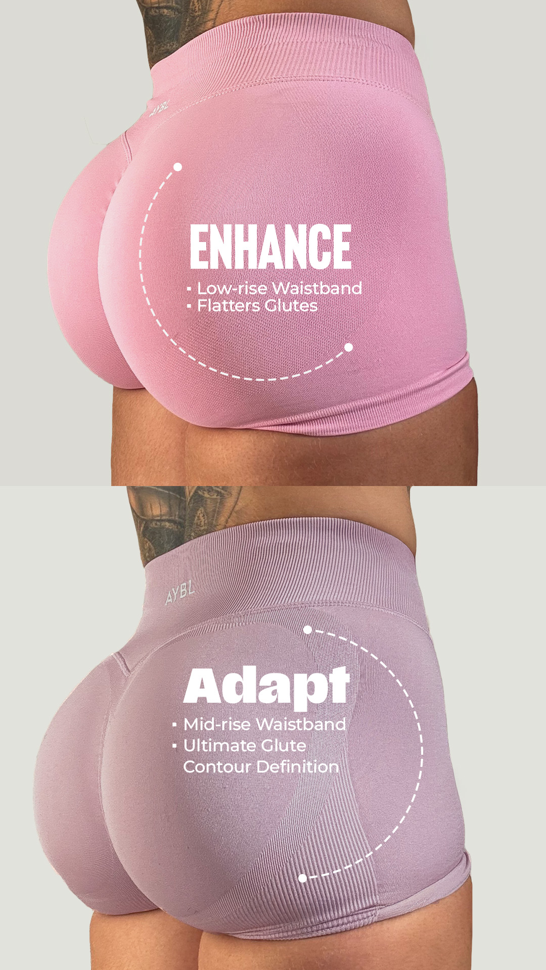
AYBL
fitness · muted earthy
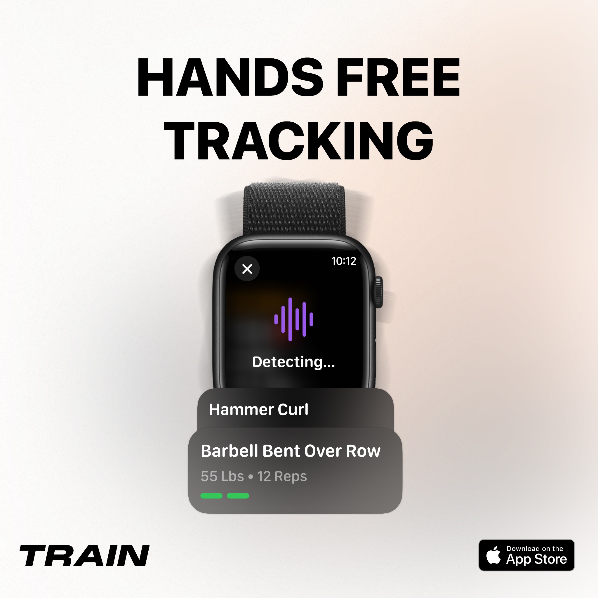
Train Fitness
fitness · neutral plus accent
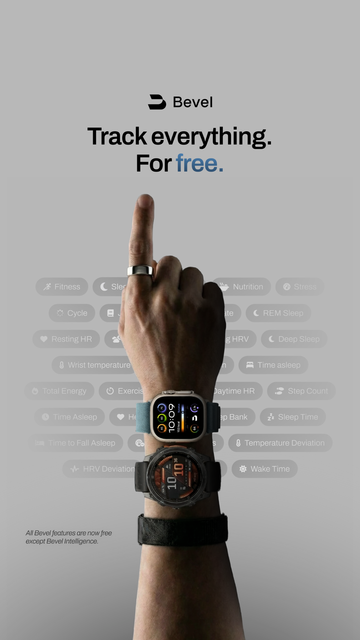
Bevel App
fitness · neutral plus accent