Novo
fintech · testimonial
8
craft
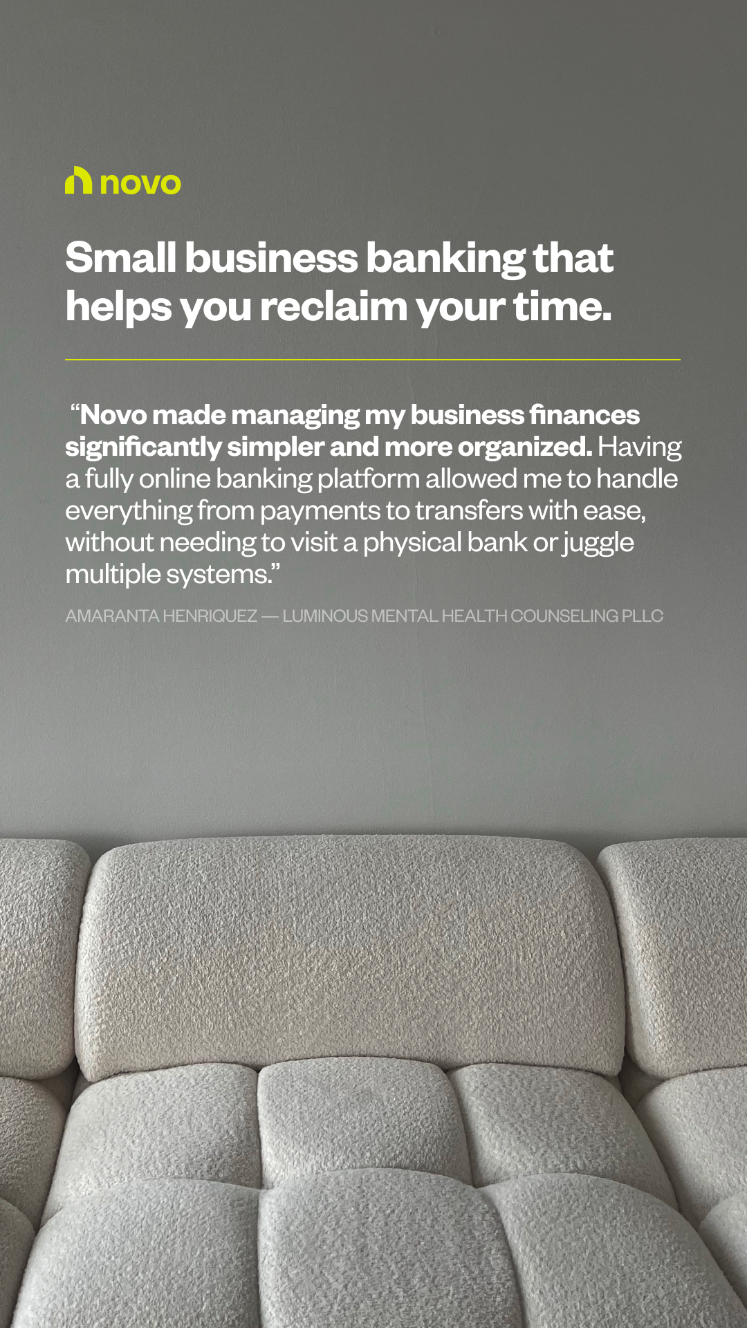
The design grammar relies on a 'top-heavy' text stack balanced against a 'bottom-anchored' visual, using a neutral photographic texture to ensure legibility.
Palette
#91918d
background · 40.2%
#656560
neutral · 26.2%
#7b7b77
neutral · 17%
#a8a8a5
neutral · 9.6%
#c1c1bf
secondary · 4.1%
#d4d5d2
text · 1.6%
Composition
headline plus visual
Layout
top heavy
Color structure
neutral plus accent
Background
photographic
Typography
sans · sans only
Imagery
photographic · realistic
Temperature
neutral
Accent lands on
logo, divider
Mood
calmreliableminimalistmodern
What makes it work
- Strict left-alignment of all typographic and branding elements
- Horizontal rule acting as a visual anchor between primary headline and body text
- High-saturation accent used sparingly for brand identity and structural lines
- Ample negative space provided by a desaturated photographic environment